// ABC
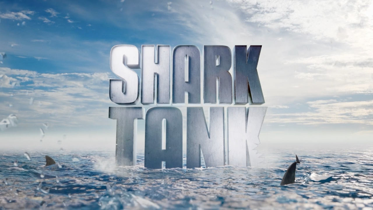
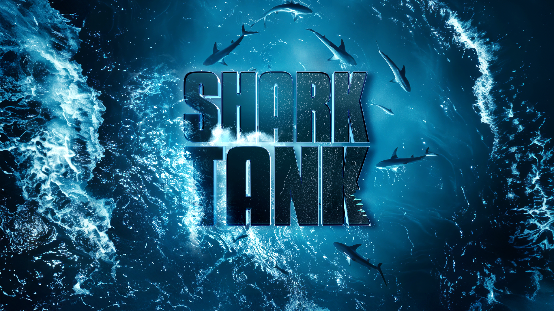
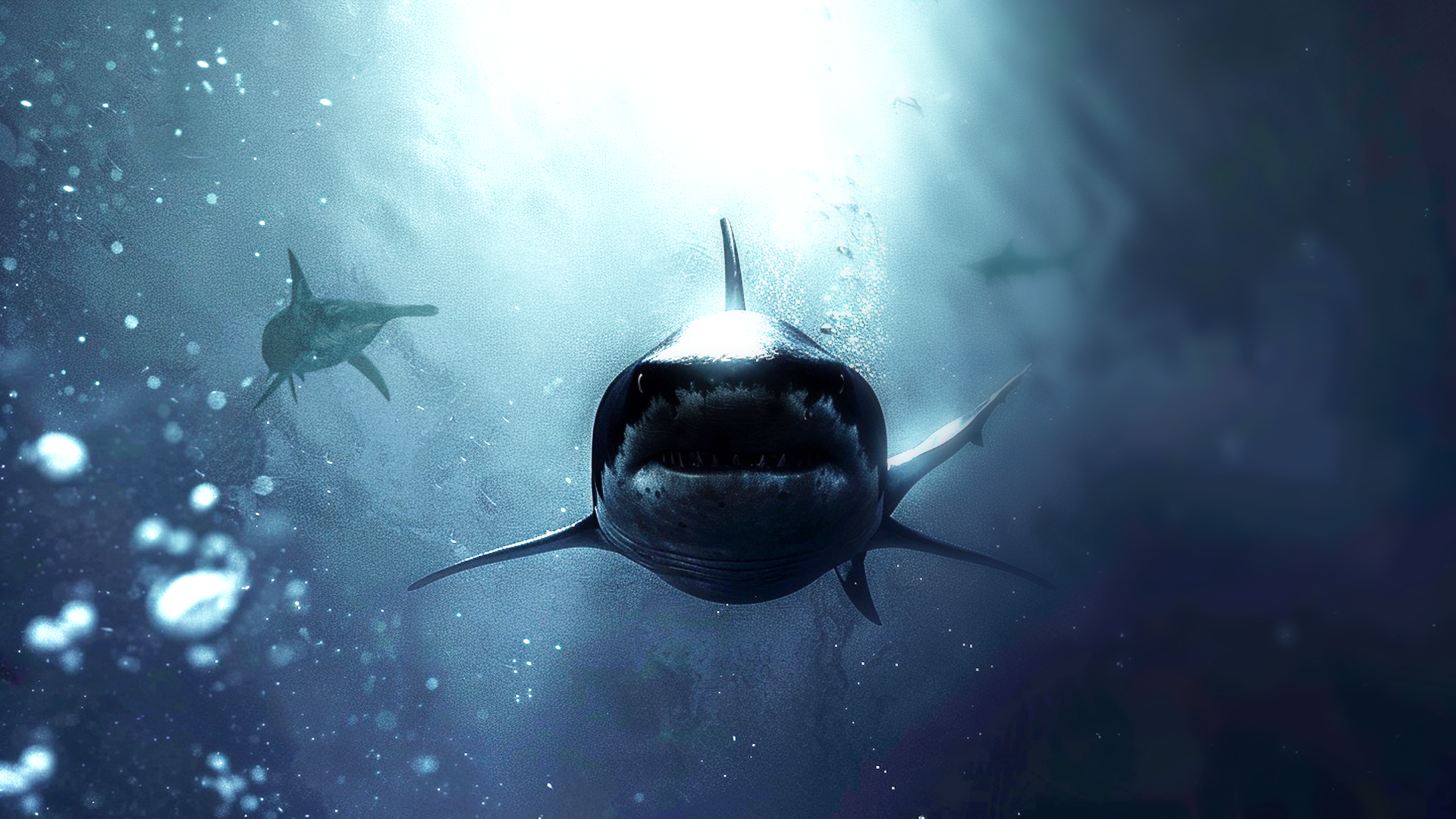
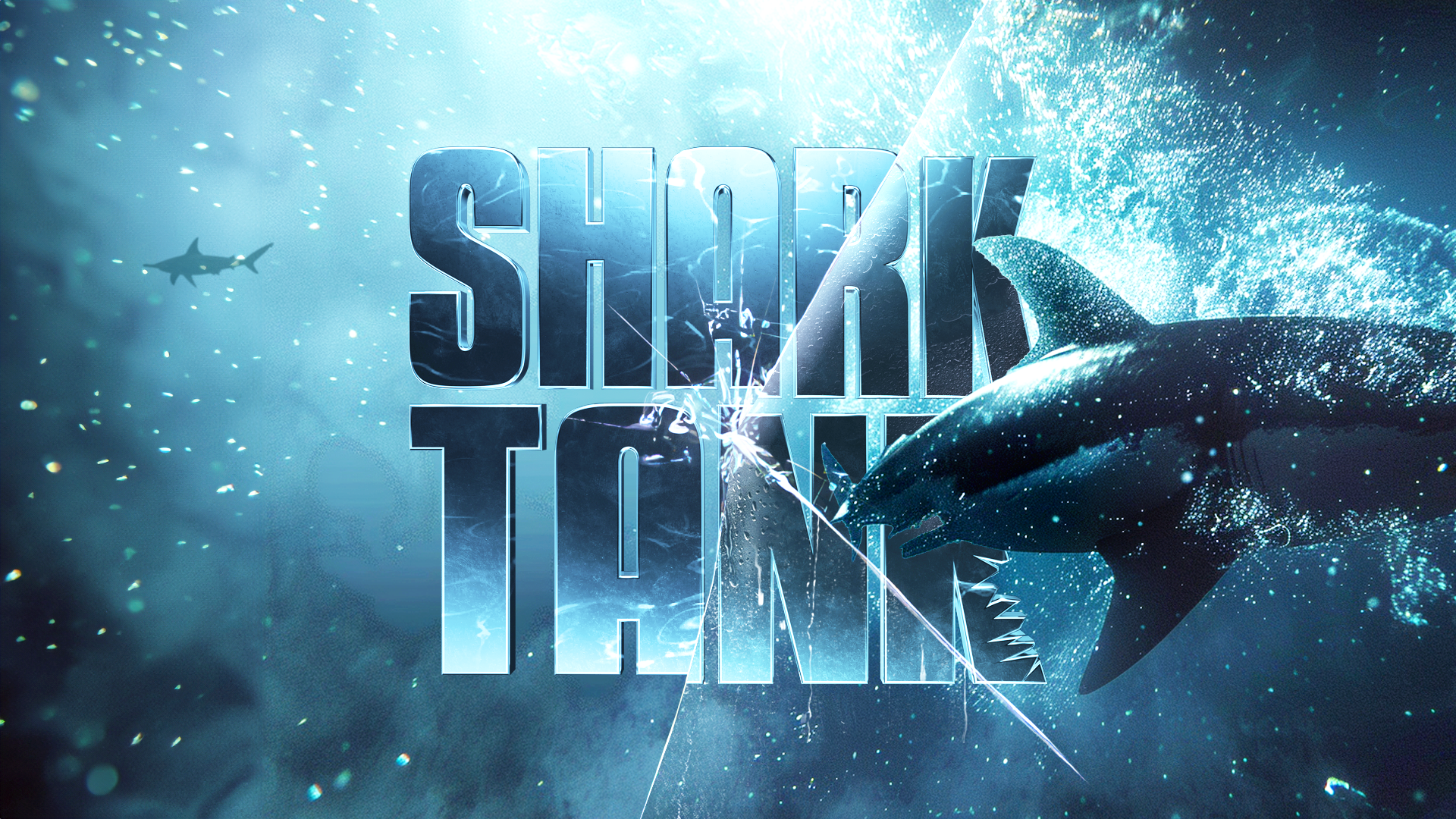
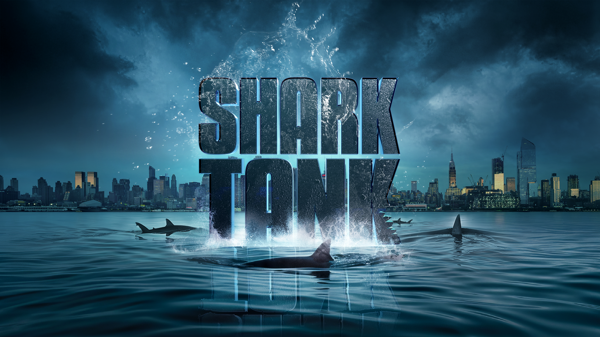
For Season 16 of Shark Tank, ABC reached out to Vivid Zero to refresh the show’s graphics package. Our team delivered an updated logo, dynamic bumpers and lower thirds all packaged up in a versatile graphics toolkit. This revitalized design suite aimed to enhance the show’s established brand while injecting fresh energy for the new season.
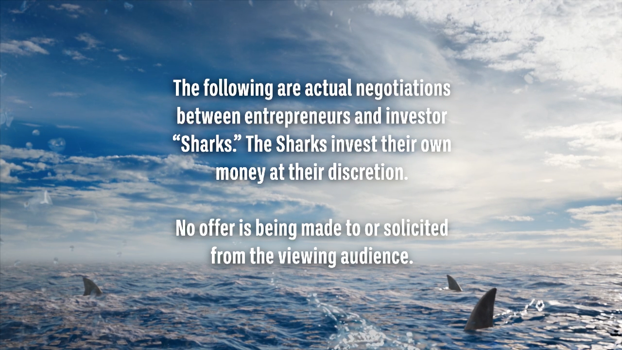
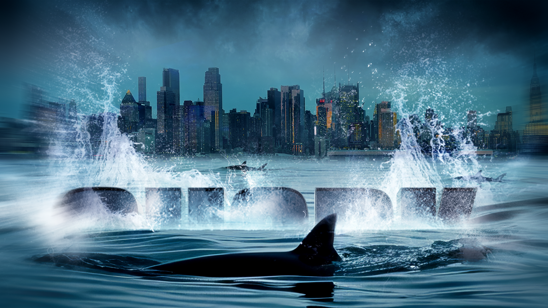
The Disclaimer graphics were created with different time of day treatments that added a sense of progression of time which could be used at different points in the show.
// EXPLORATION
We explored multiple directions before ultimately landing on a brighter, more optimistic aesthetic that aligns perfectly with Shark Tank’s inspirational and entrepreneurial spirit. We liked exploring the idea of the sharks swimming in an ocean of money circling and waiting for the next big idea to emerge. This direction ultimately reinforces the show’s core themes of the high stakes opportunity and risk while instilling a sense of hope of the aspiring entrepreneurs trying to make a splash in the business world.
// LOWER THIRDS SYSTEM
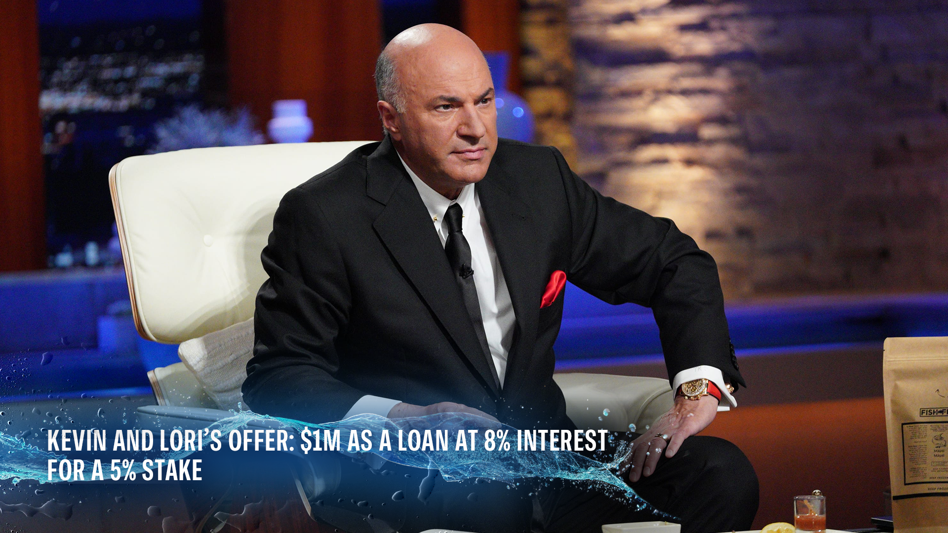
We visually integrated the opening sequence’s aesthetic into the updated lower thirds system, creating a cohesive look that reinforces the overall branding of the show.
