// JASONS WATER SYSTEMS
Vivid Zero rebrands Jason’s Water Systems. Jason’s Water Systems, a regional company in Texas with sights on country-wide expansion, looked to us to evolve their brand identity. We dove in deep, pun intended, to really understand the legacy of the brand and to create a new logo and brand foundation that could take them into the next phase of their growth and beyond.
ICONIC
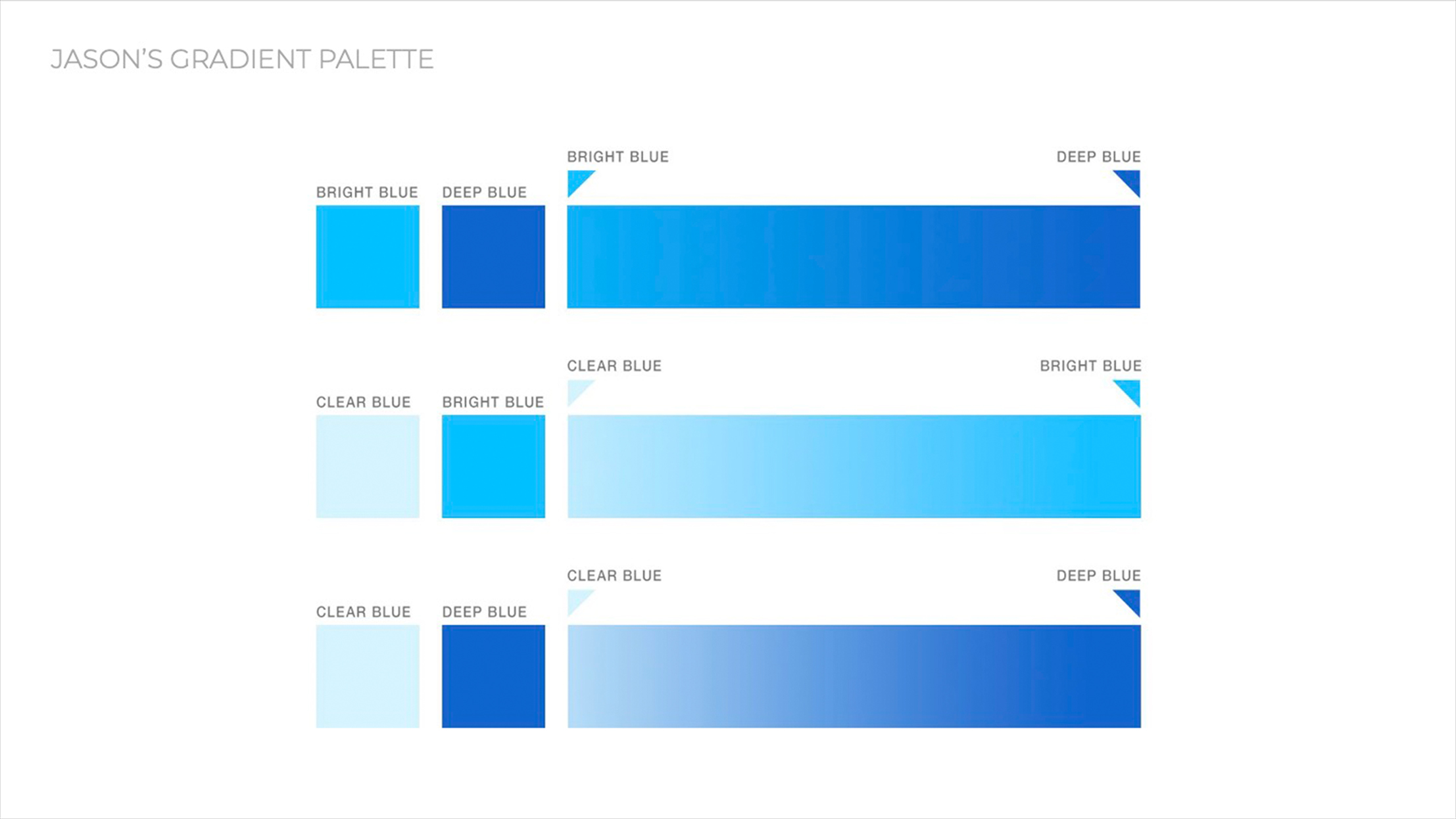
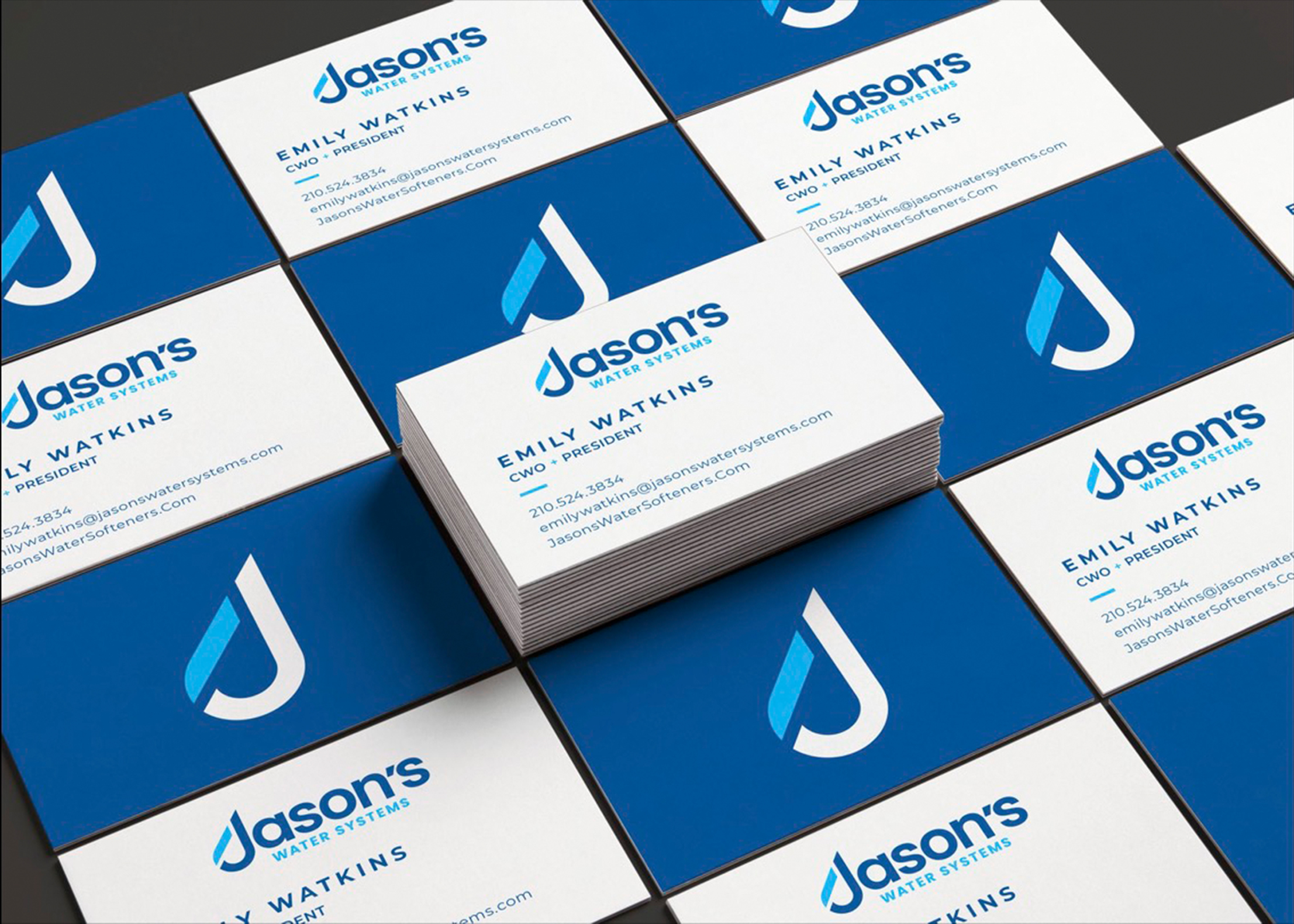
We focused efforts on a modern mark that tied into the logotype as well as a mark strong enough to stand alone. Our new J Drop provided the perfect solution. And with a water company, only the color blue seemed right. So, we created a color combination of blues that would complement this mark and make this brand identity stand out.
BEFORE + AFTER
We understand that there can be legacy, history, rationale, and deep emotions with existing logos. It is never easy to completely move away. When we started to explore the new identity, we looked at evolution of the existing mark as well as a complete departure. Inevitably our client was extremely happy with their decision to modernize.
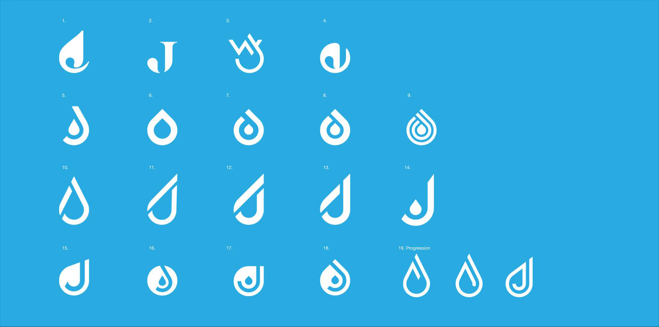
EXPLORATION
During the course of our project, we explored several icons, logos, fonts, shapes, colors, concepts and logo marks to help get us to the perfect logo through our refinement process.


