// GRIFFIN MEDIA
“Vivid Zero was a pleasure to work with on this project. It was refreshing to work with a creative agency that really listened, understood what we were trying to accomplish, researched and understood our market, and then delivered work that was not only award-worthy but also accomplished the goals we set out for our on-air graphics – clean, fresh, clear and visually striking while reinforcing our home – Oklahoma.”
– Houston Hunt, Vice President of Marketing / Griffin Media
Vivid Zero partnered with Griffin Media to revitalize and modernize their local news packages across their two stations. Oklahoma City and Tulsa. We developed a cohesive visual identity through a collaborative process, including a new design theory, framework, and animation that ensures versatility and resilience in the dynamic news landscape. Our teams worked closely to create a package that enhances viewer engagement, reinforces clarity, and helps deliver high-quality news content to their viewers. We developed comprehensive toolkits for Griffin Media to streamline and implement the graphics system across all stations.
BRAND THEORY
// BUILDING BLOCKS
When we started collaborating with Griffin Media, we looked at the communities they serve. As a local news nation we wanted to create a graphics package that resonated with the viewers and their community. In a world filled with continuous urgency, we wanted to make a calm, clear, and straightforward environment to tell the news. This brought us to look at the Horizon which has always captivated humanity, symbolizing calmness and anticipation. Our design theory was inspired by that timeless horizon, embracing its simplicity and symbolic power. We incorporated clean lines and expansive views. It is human nature to look to the horizon. If there is no imminent threat, we get a sense of calmness. And Griffin Media watches that horizon to help keep Oklahomans safe and informed.

The foundational graphic elements that serve as the building blocks of this package are inspired by indigenous design and symbolism. This was a way to integrate and pay homage to the regional heritage while developing a versatile visual language that feels modern and digital forward. This design system has various utility, serving as navigational elements and that is not only pleasing to the eye but also helps guide viewers through the story. The soft, subtle curves create a familiar and inviting environment while allowing the urgency and seriousness surrounding the news.


OPENS
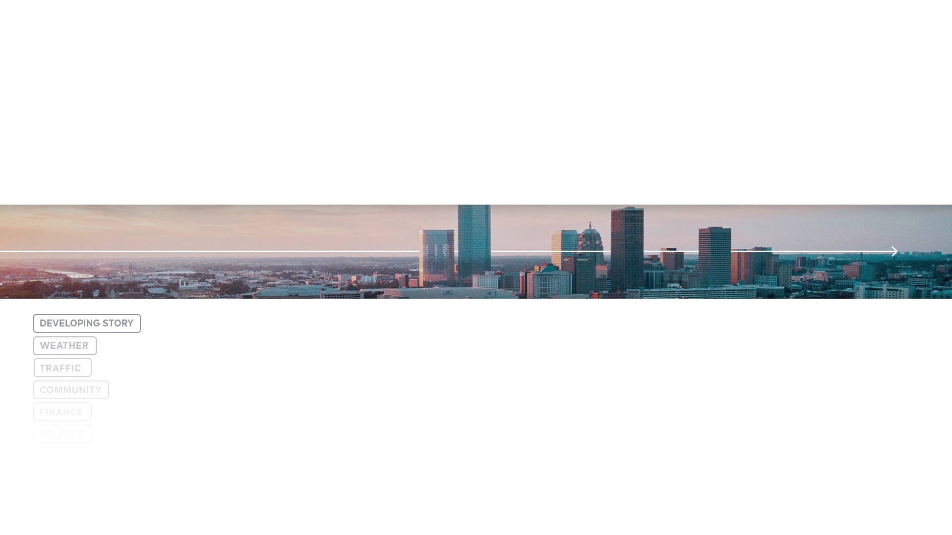
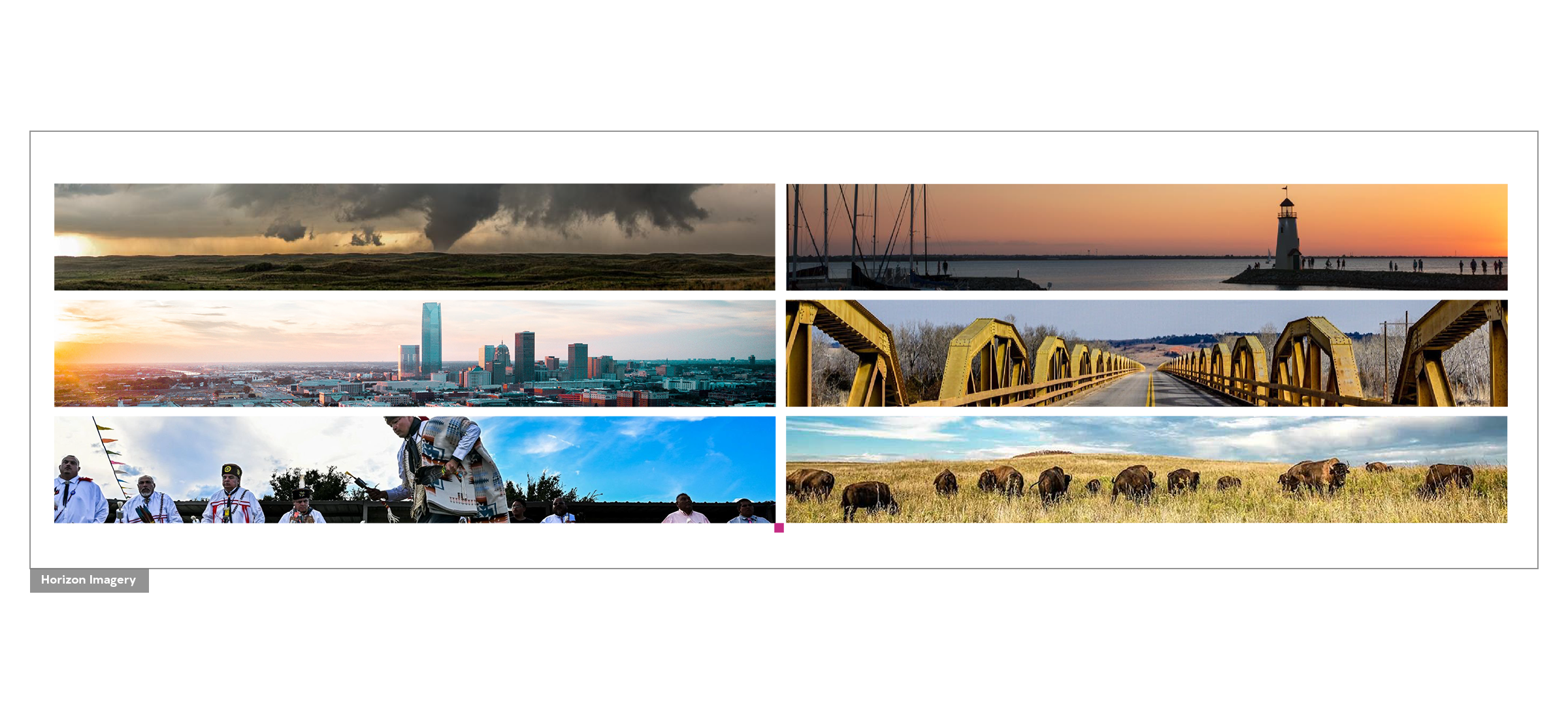
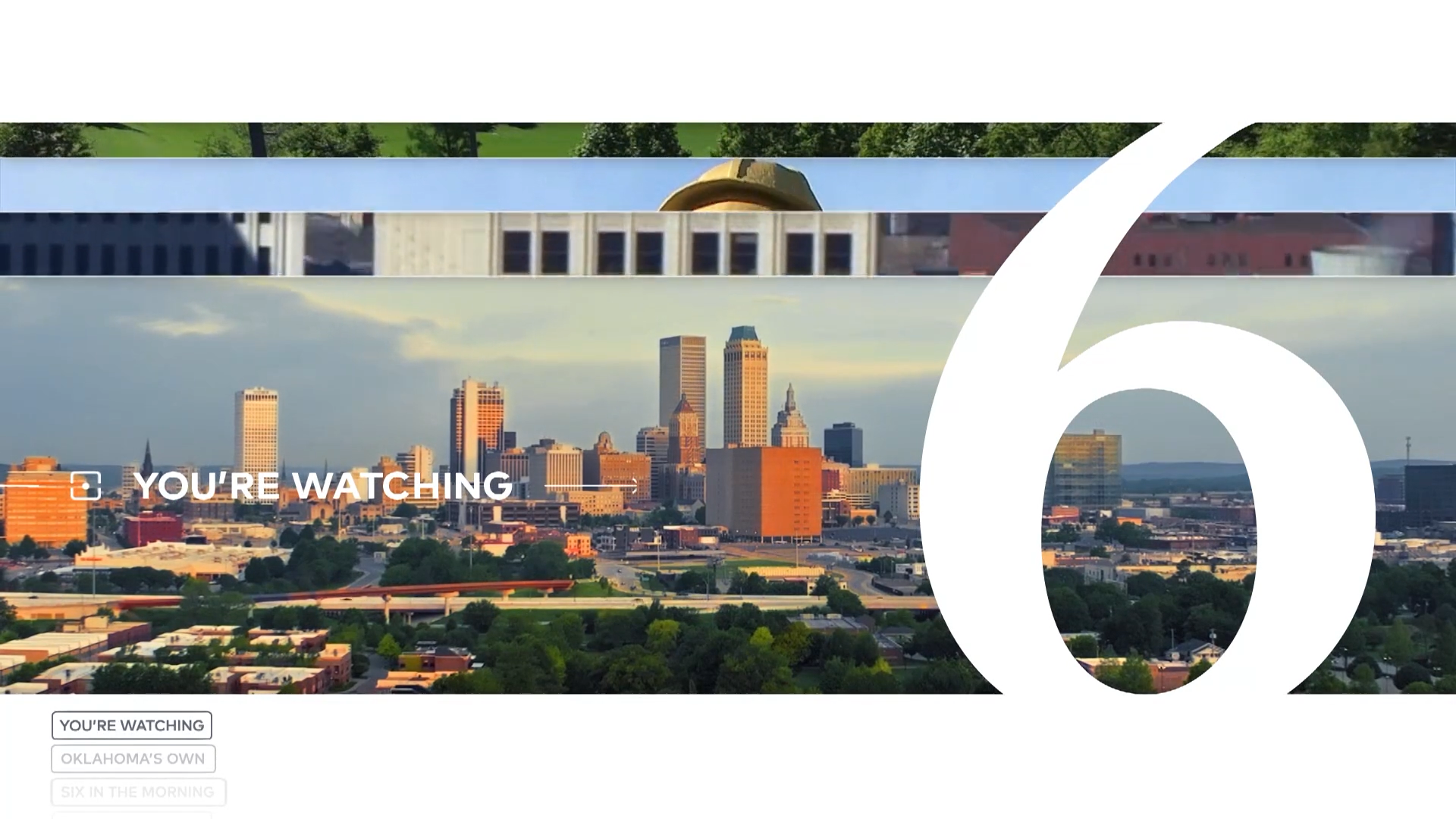
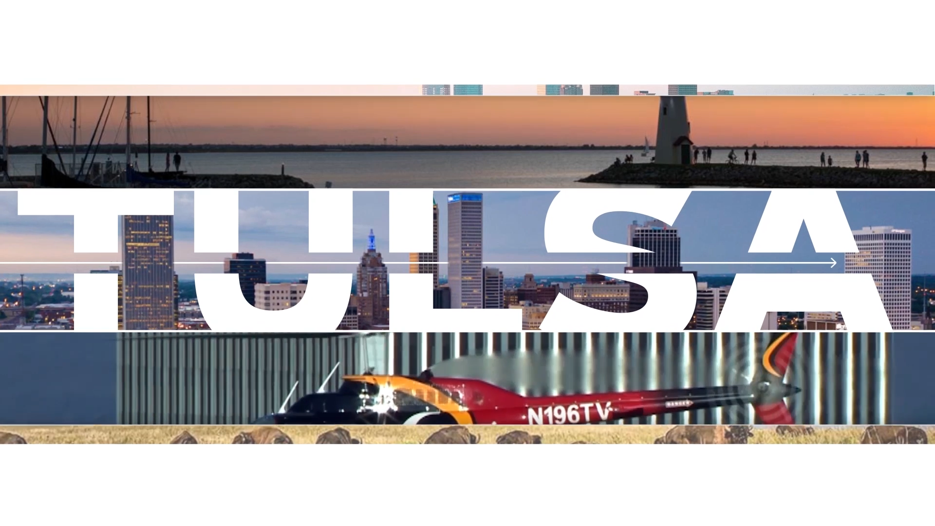
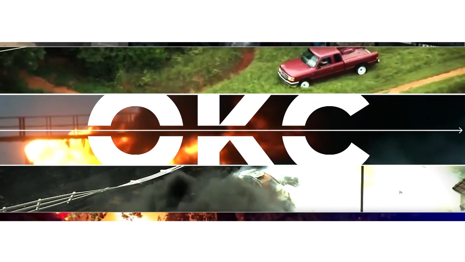
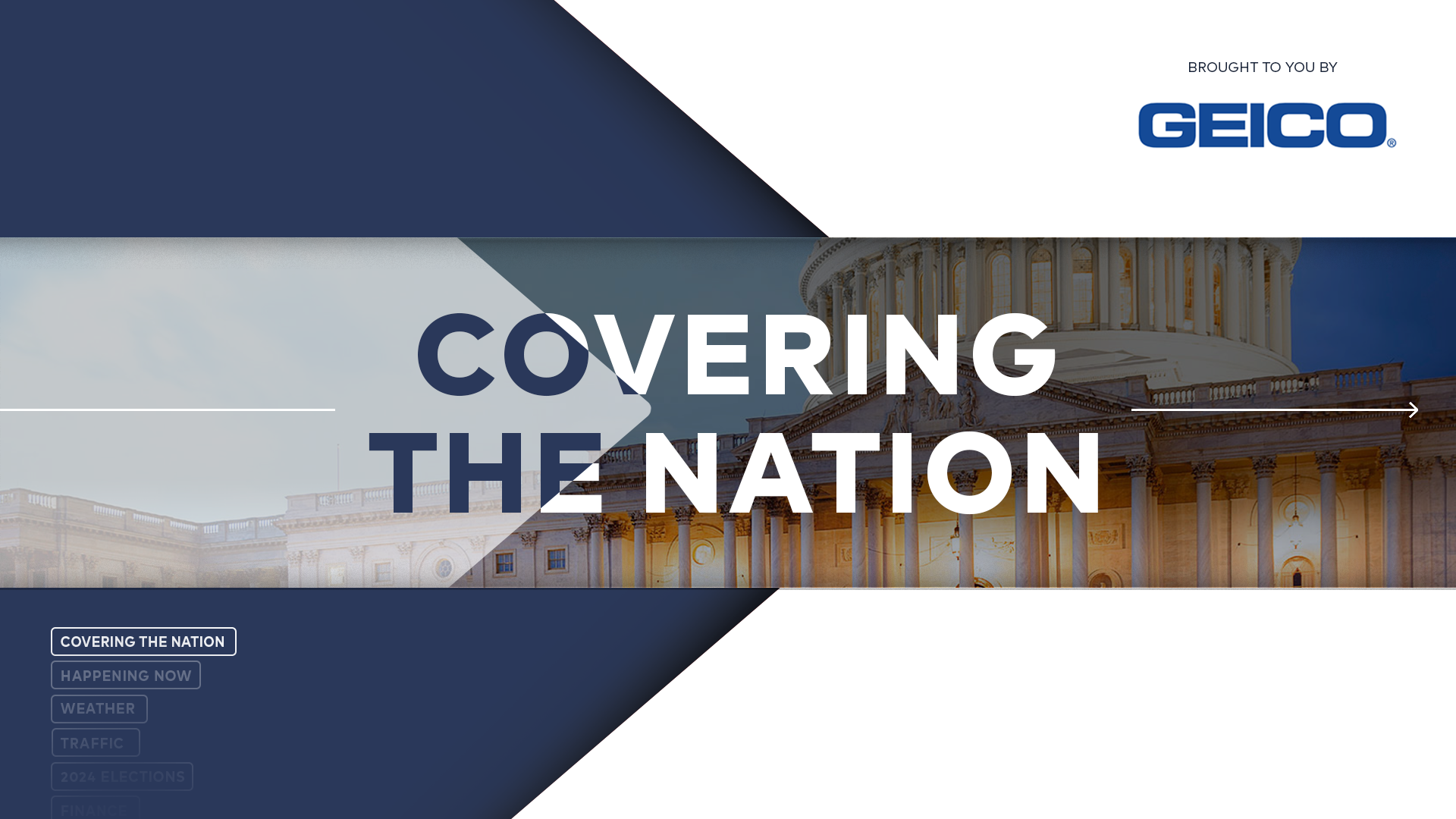
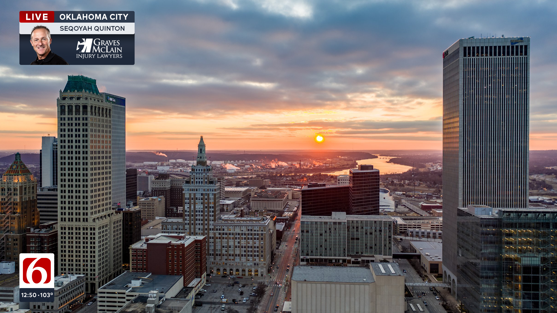
// THE HORIZON
We developed a simple yet versatile open that integrated a content-forward approach to elevate and connect the viewers and the local community. The dynamic and editable horizon modules provide the opportunity to insert fresh photography or footage. By leveraging city landmarks, neighborhoods, activities, culture, and people to make up our opens and connect our viewers to their communities and their stories. This approach allows the opens to easily be updated throughout news cycles and always keeps the newscast fresh.
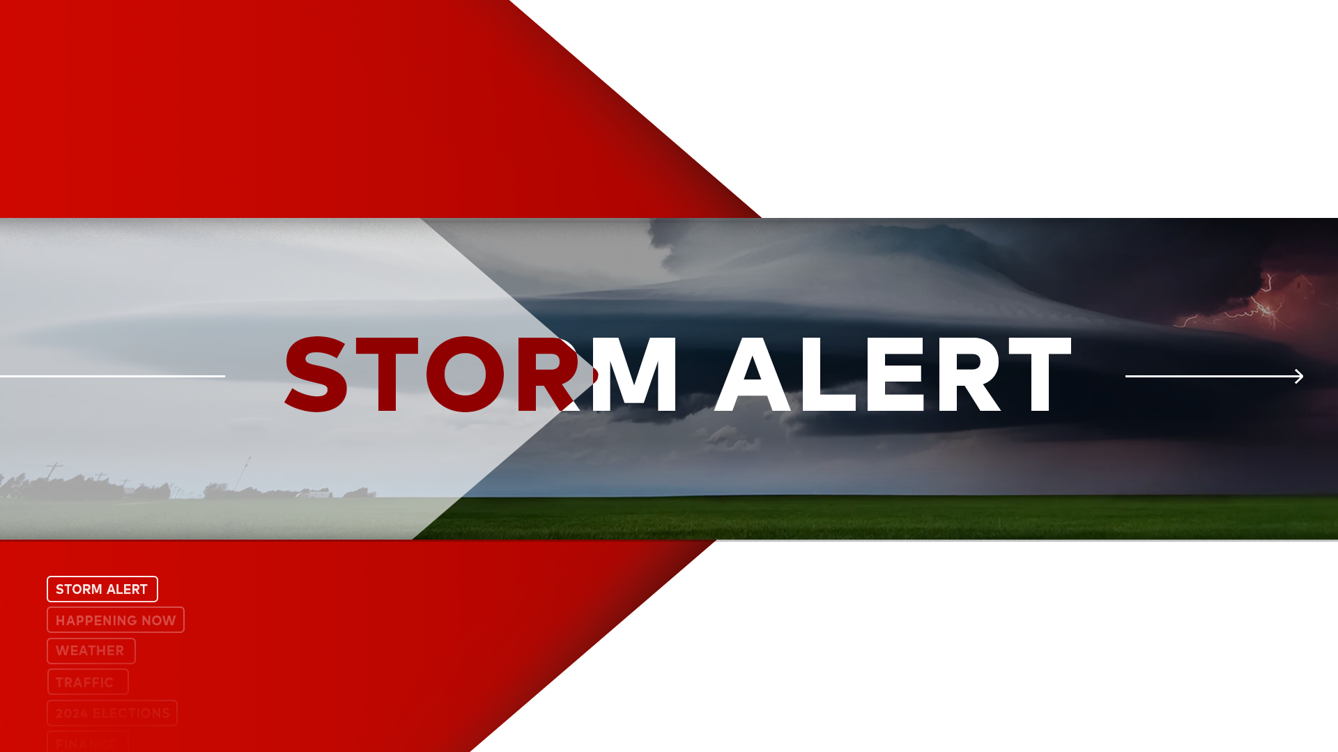
// MINI OPENS
The Mini Opens are short animation sequences that utilize the same horizon module and serves as a transition as well as a tease into the upcoming story. These opens are modular and can easily be updated with imagery and text allowing for the news director to easily create various mini opens to support their storytelling needs. Additionally, this also has room for sponsorship placements.
// TRANSITIONS
Transitional graphics and the rejoiner further reinforce the brand theory throughout the newscast.
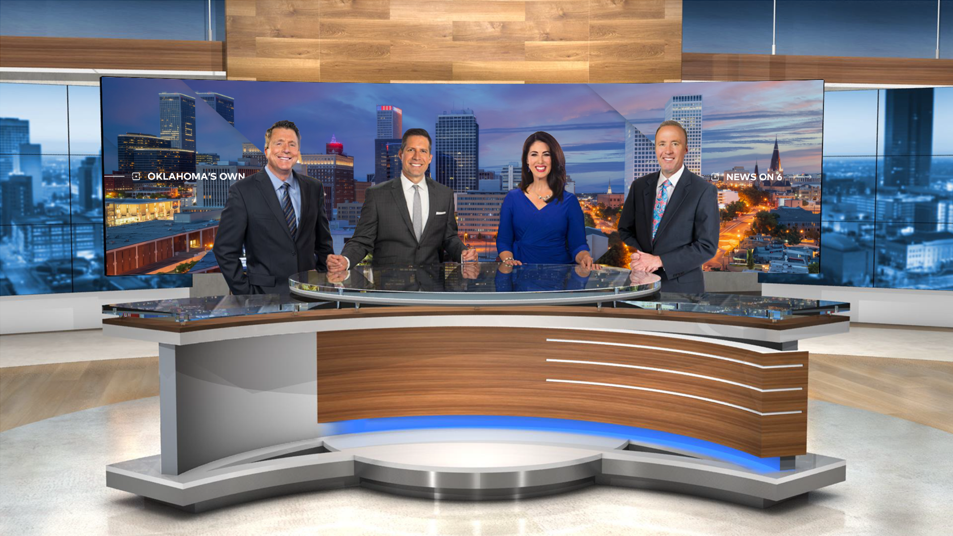
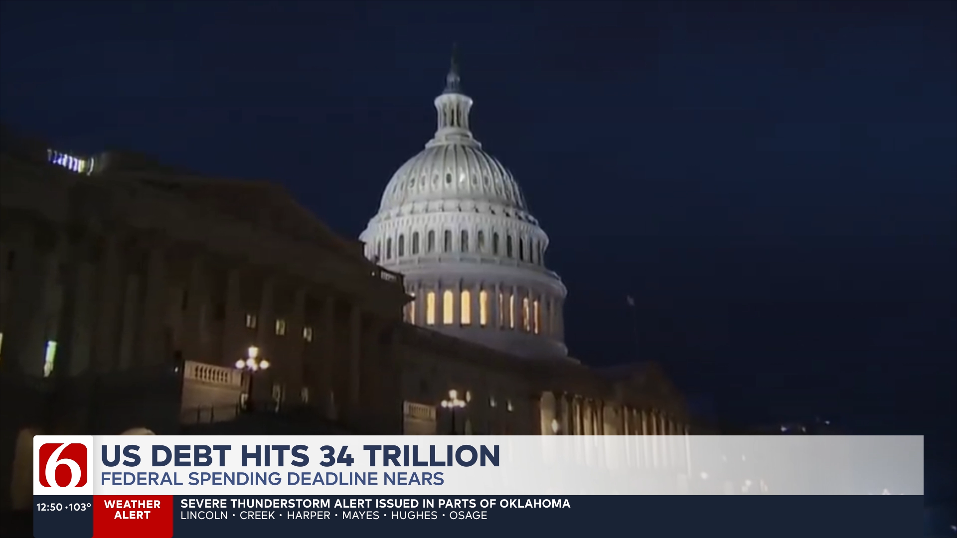
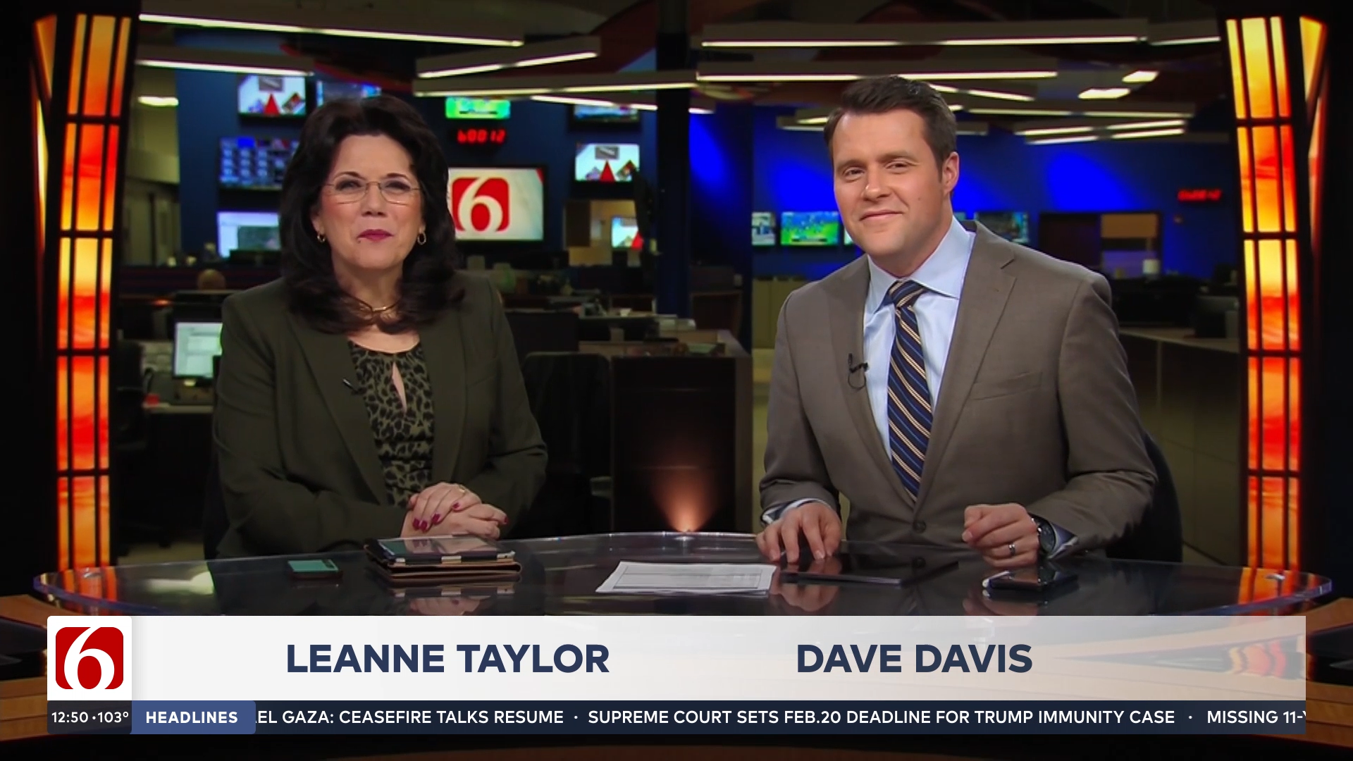
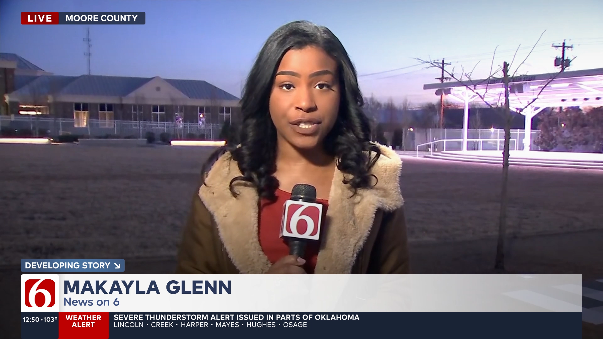
BASELINE + LOWER THIRDS SYSTEM
// A VISUAL ANCHOR
The cornerstone of our graphics system is the lower thirds and baseline system—a crucial element that captures the most attention. We’ve crafted a simple, yet powerful design that’s both elegant and intuitive. This streamlined system incorporates modular configurations, thoughtful typography, strategic imagery, and clear navigational elements. While adhering to the brand’s structural foundation, it offers viewers a sense of engagement and control. Our goal was to prioritize clarity and efficiency, resulting in a design that’s easy to comprehend and visually appealing. This essential component not only informs but enhances the overall viewing experience, seamlessly blending functionality with the overall brand theory.
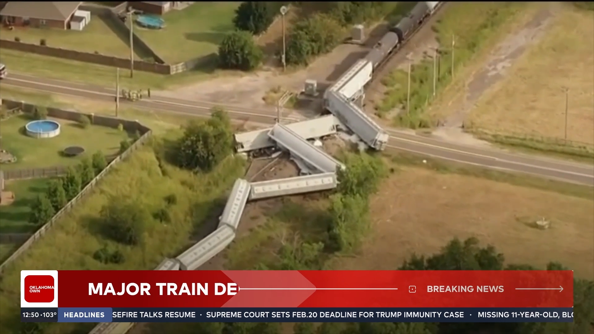
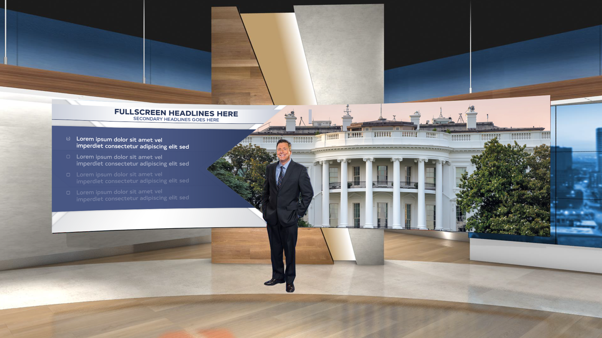
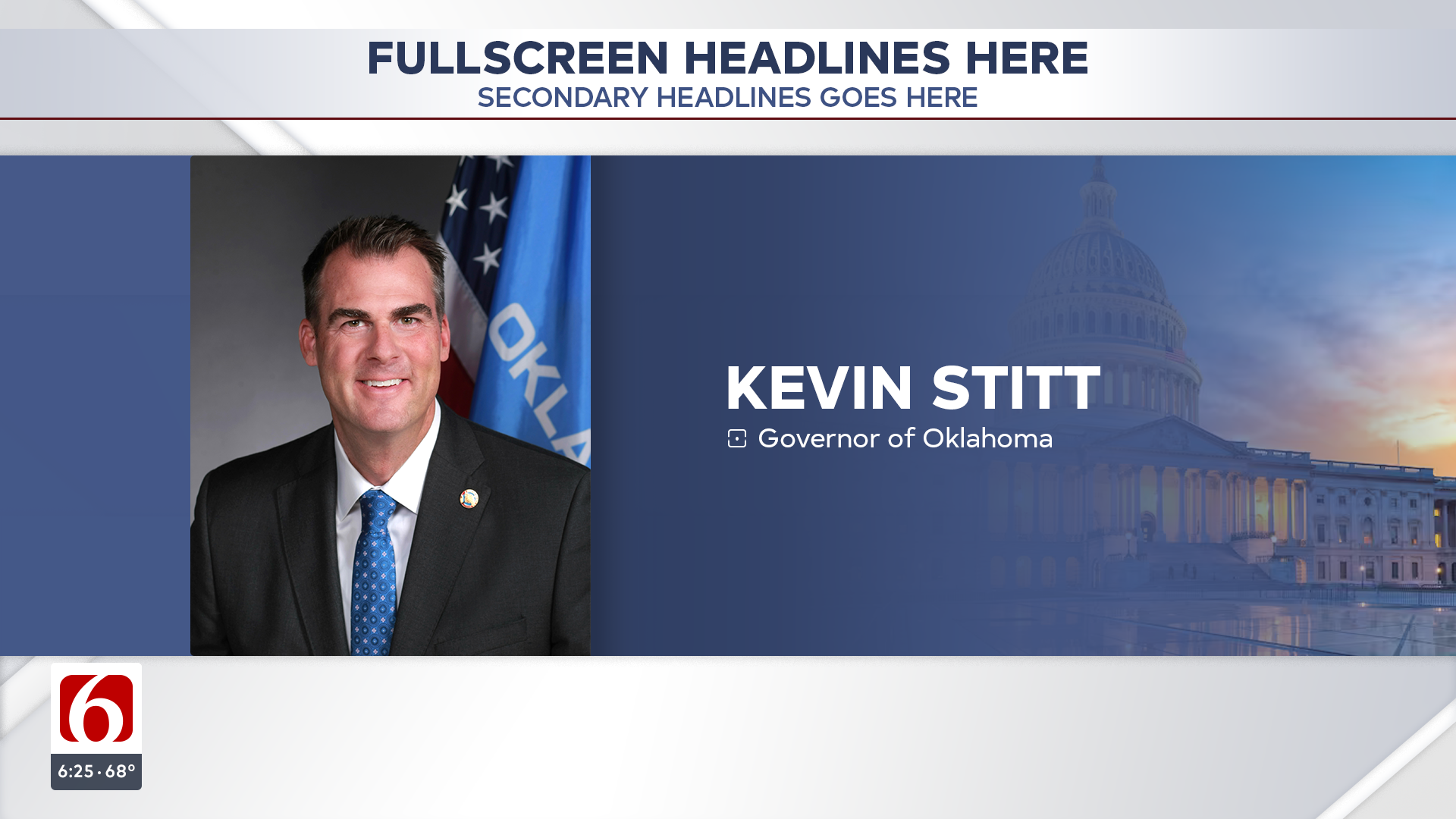
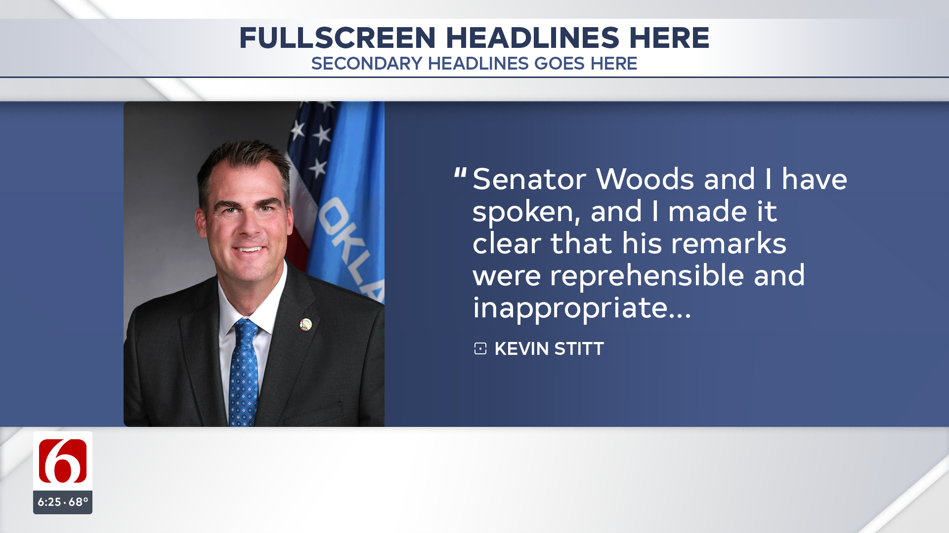
FULLSCREEN SYSTEM
// FRAMING THE STORY
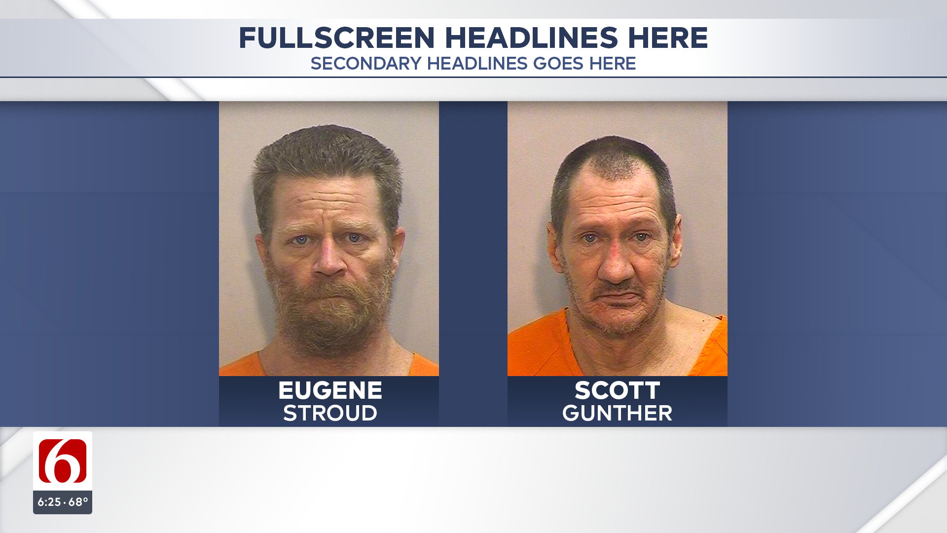
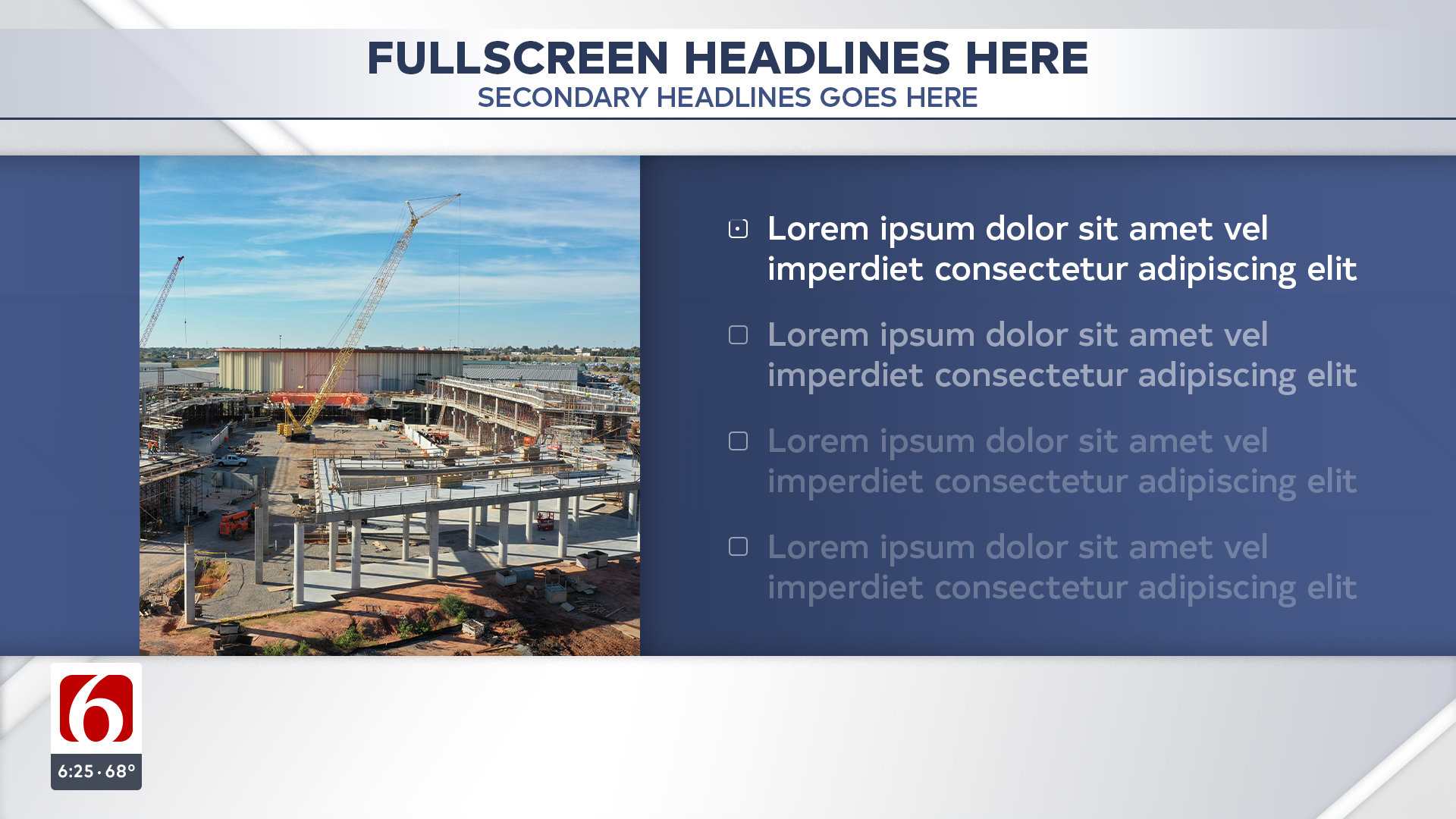
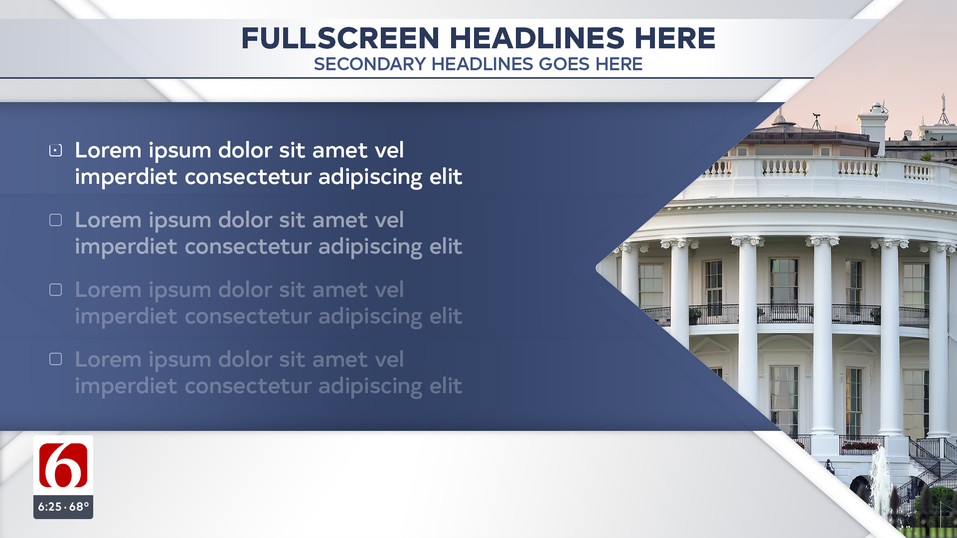
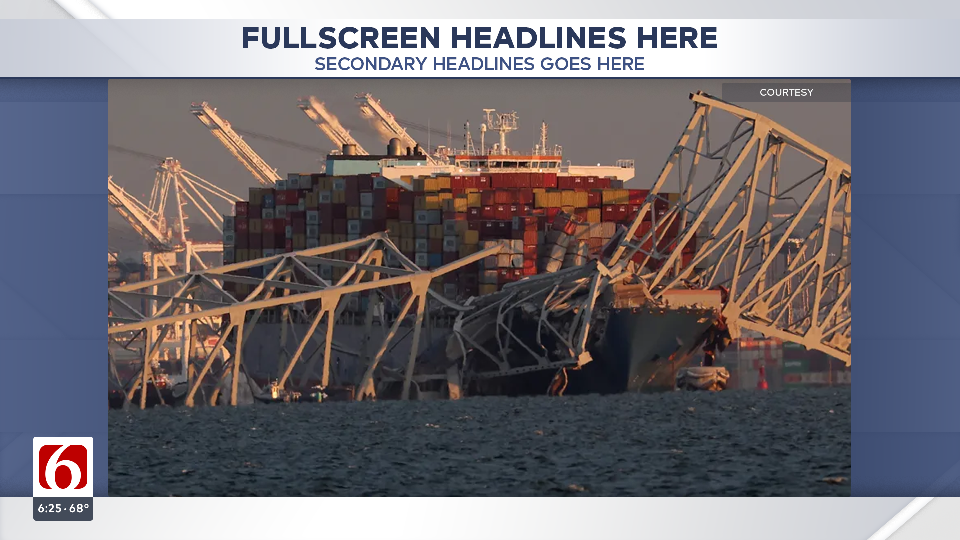
The Fullscreen system serves as an important component of the package that offers expansive storytelling capabilities. A simple clean plate holds the graphics in place. The subtle movement in the background echoes the brand theory’s design system, while the horizon module serves as a backplate that helps hold all of the information displayed. This allows space for additional information such as Quotes, Verbatims, Phone interviews, Mug Shots, Bullet Points, and more.
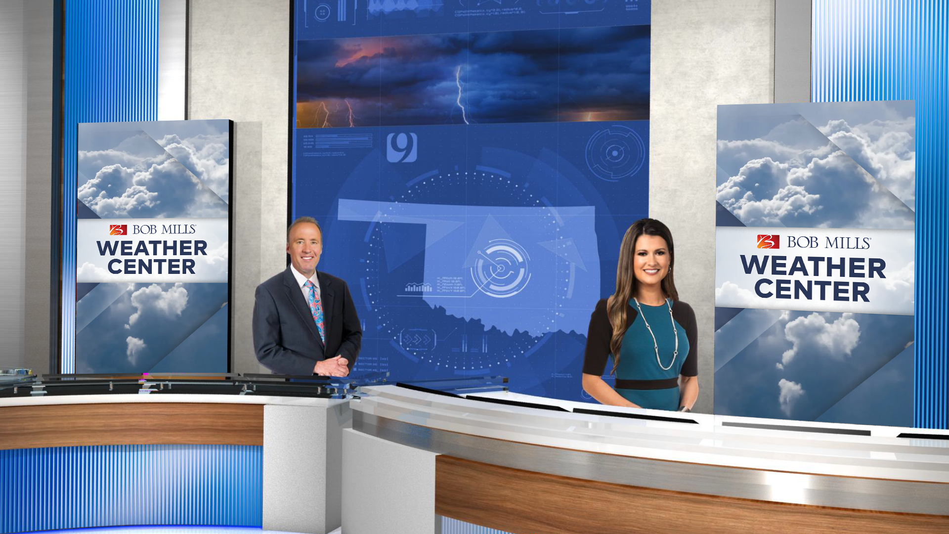
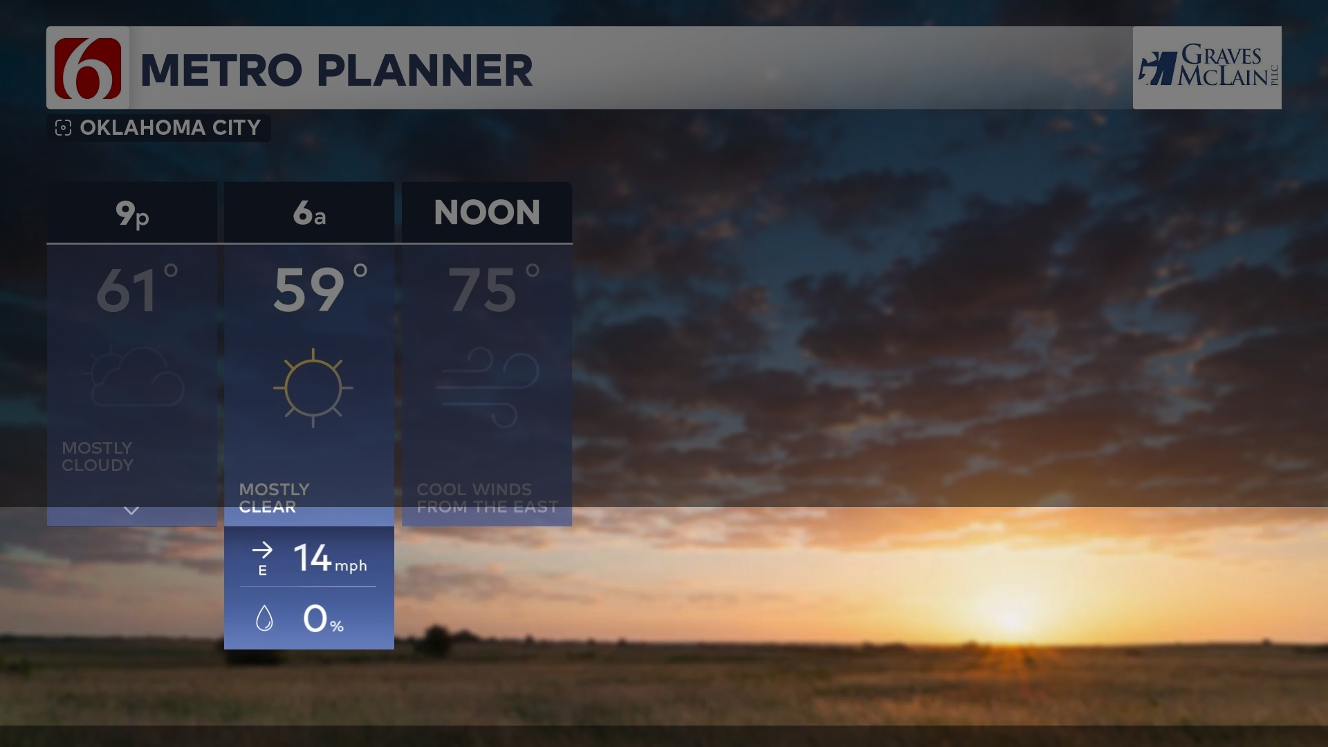
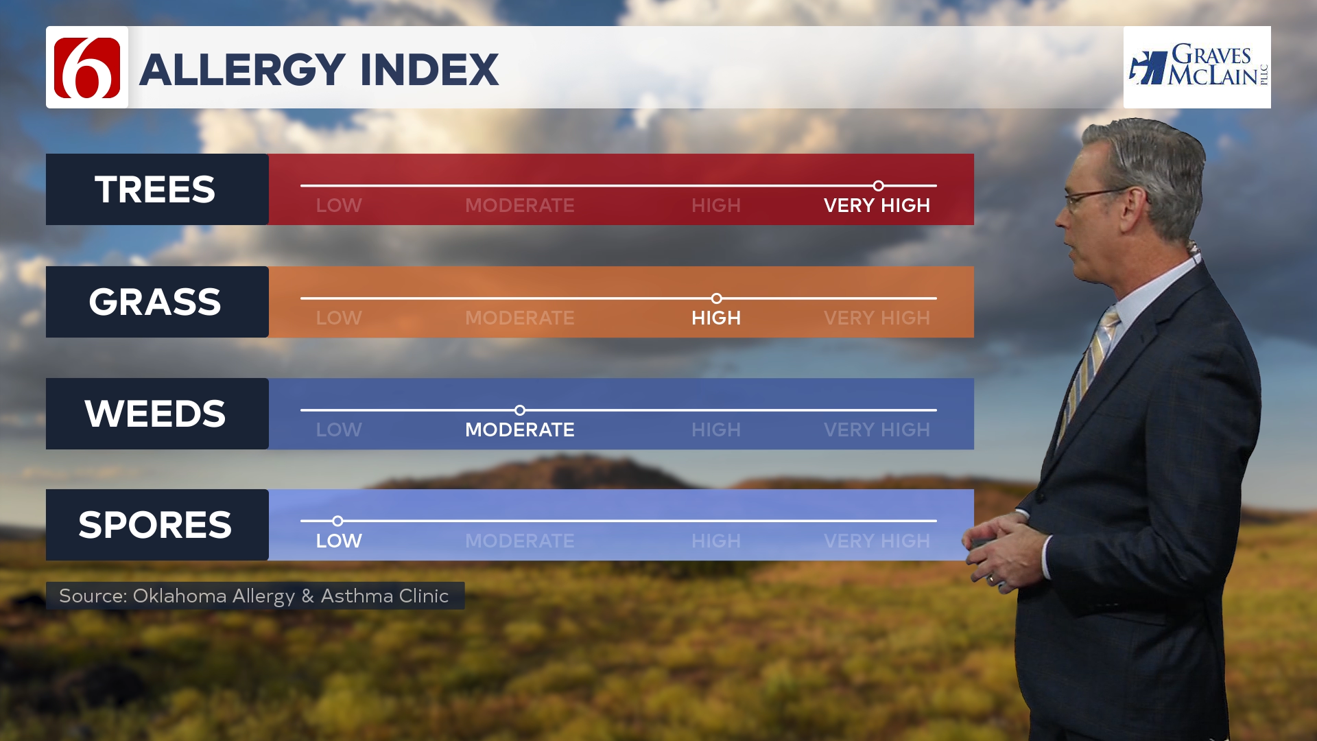
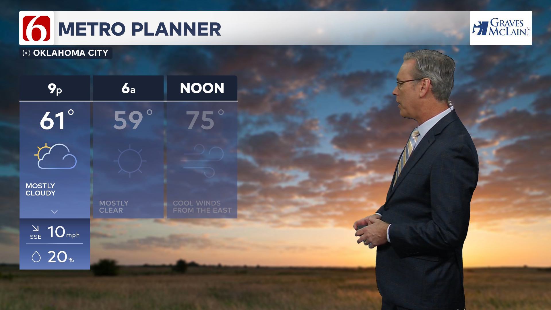
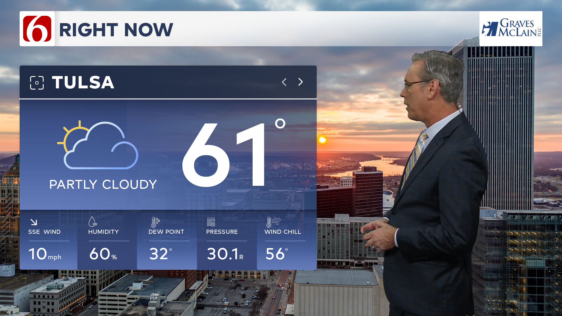
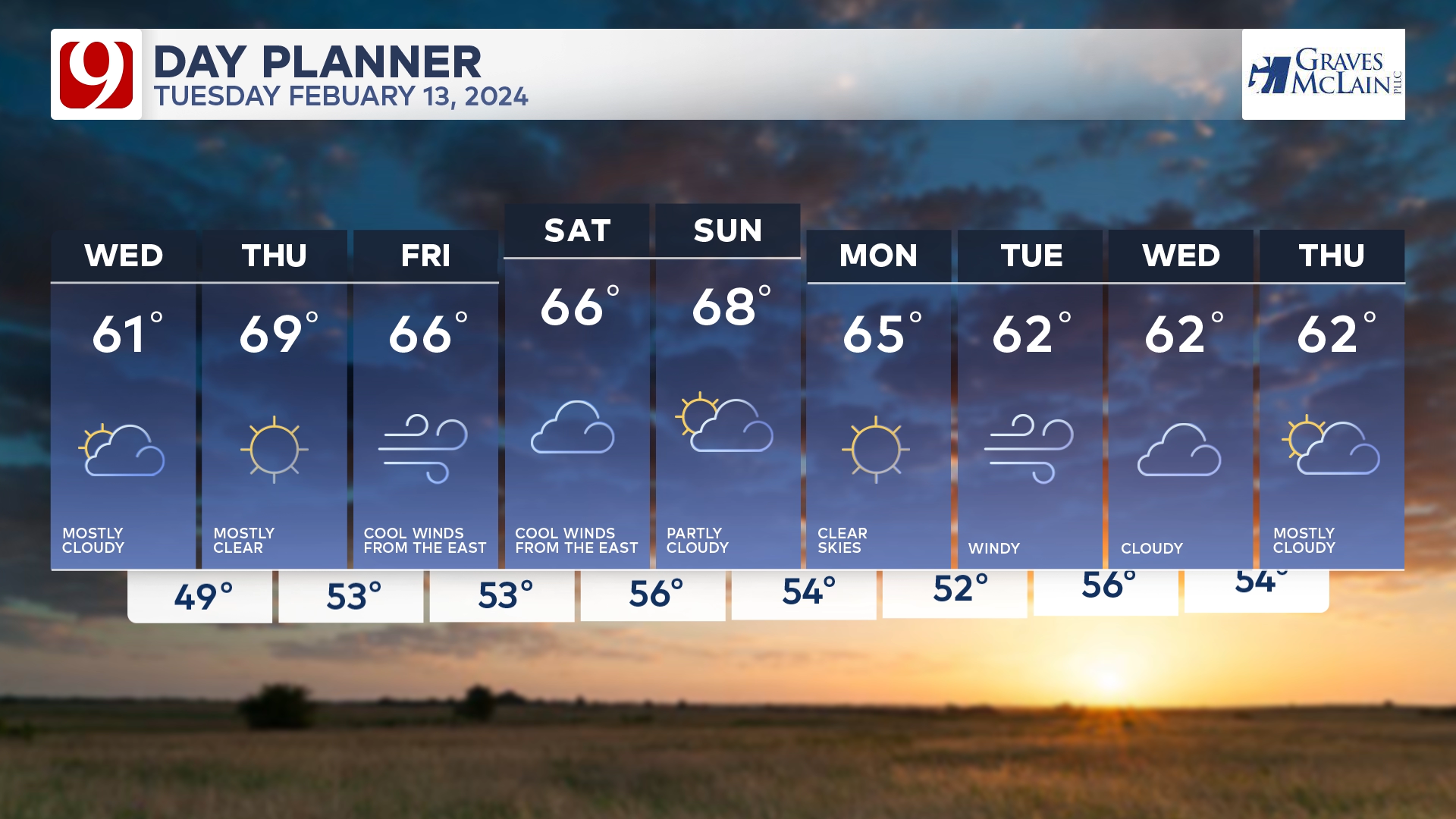
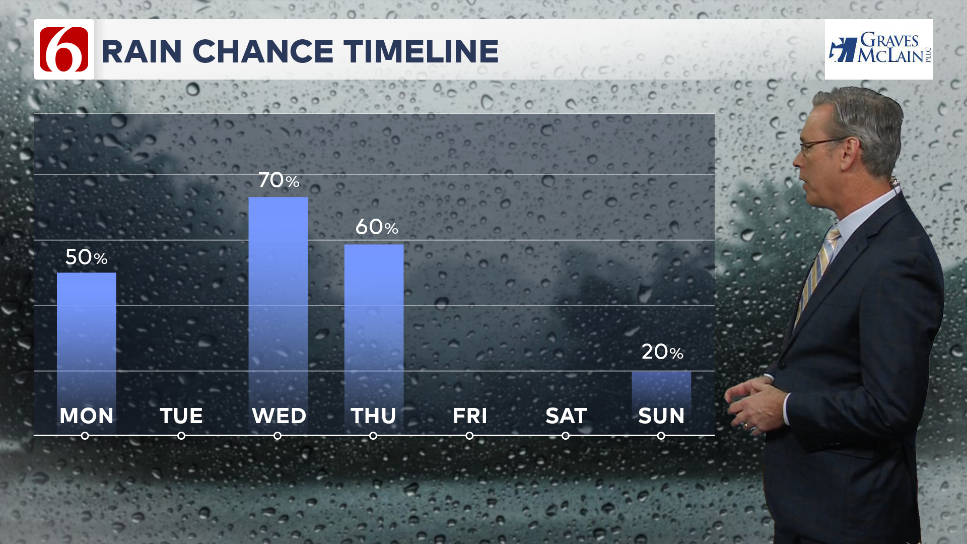
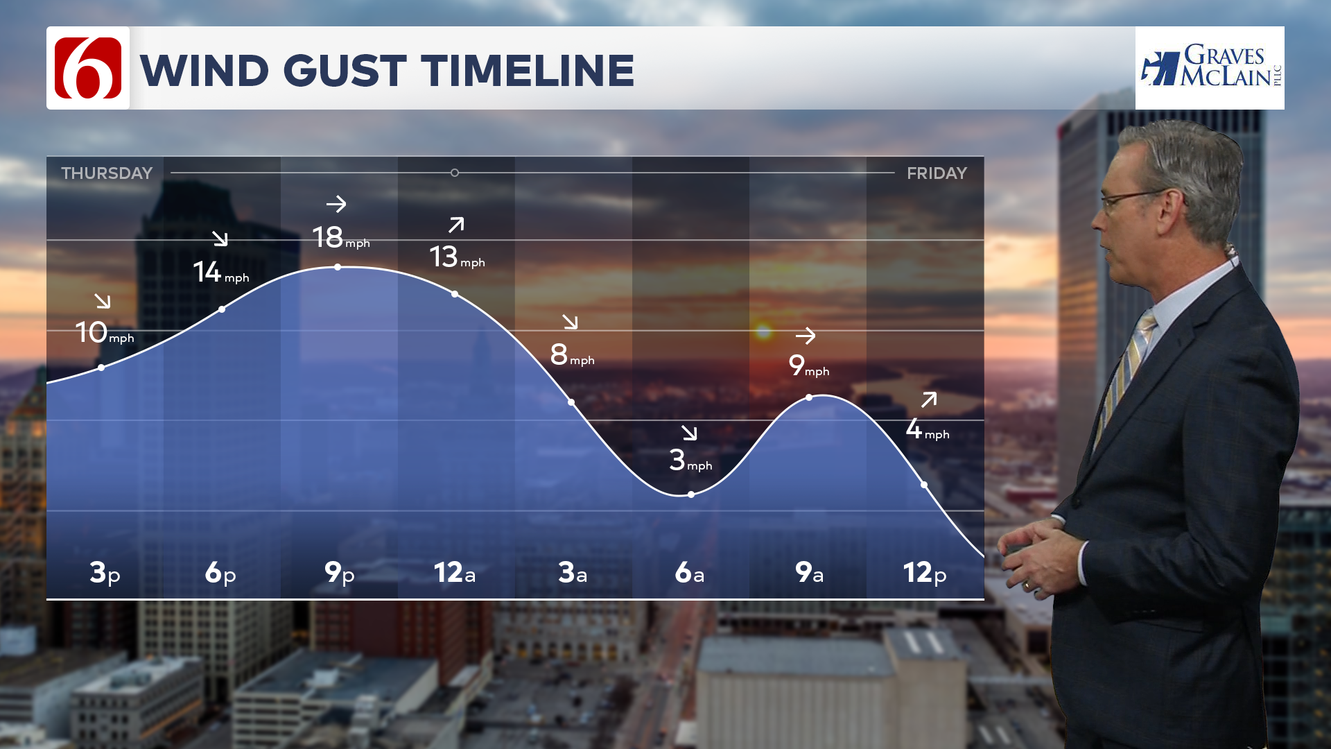
WEATHER SYSTEM
// FORECASTING WITH CLARITY
The weather package pushes the boundaries of television meteorology by providing meteorologists with cutting-edge tools for impactful presentations. Featuring a custom-designed weather iconography, this modern system redefines linear weather graphics integrating broadcast traditions with a sense of digital interactivity. Its versatility and customization streamline workflows while enhancing viewer engagement. The design hints at interactivity through dynamic motion, allowing the meteorologist to start with simple information and expand modules to reveal more details as needed. This creates an engaging experience that aligns with today’s digital expectations.
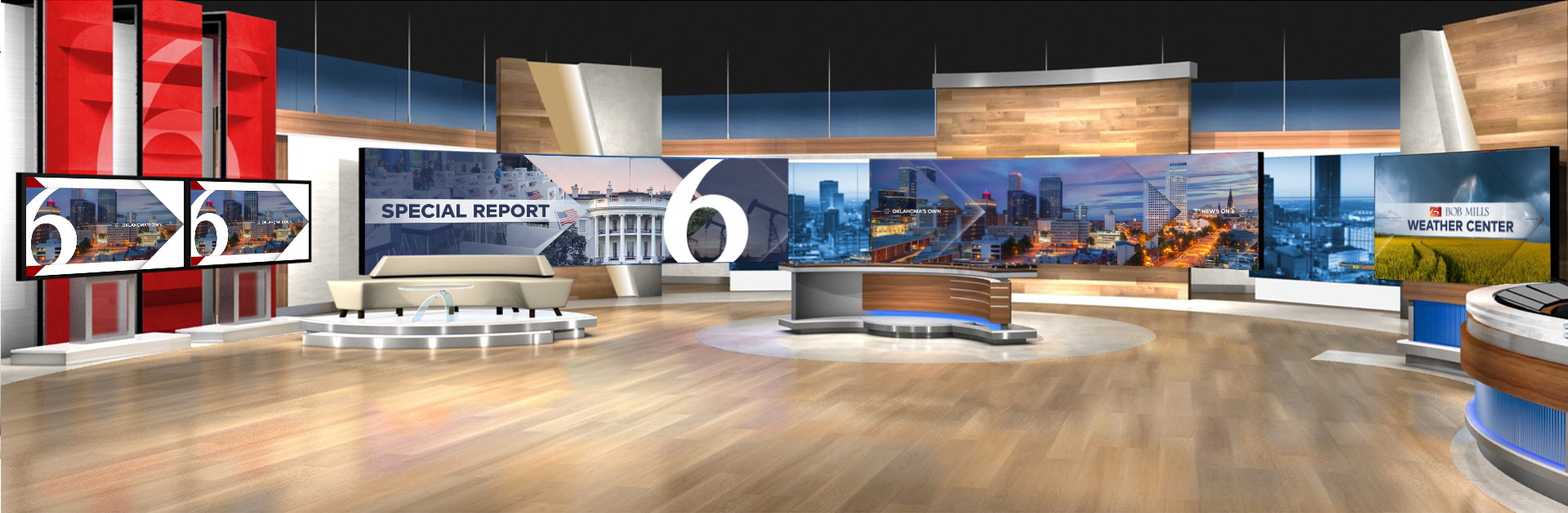
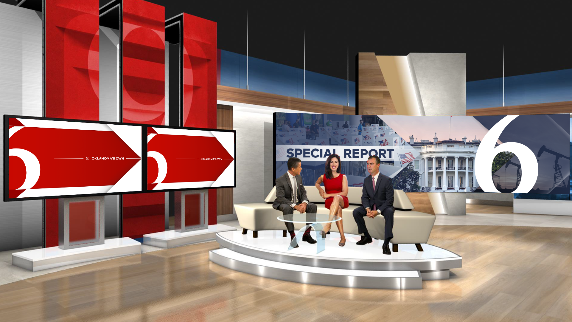
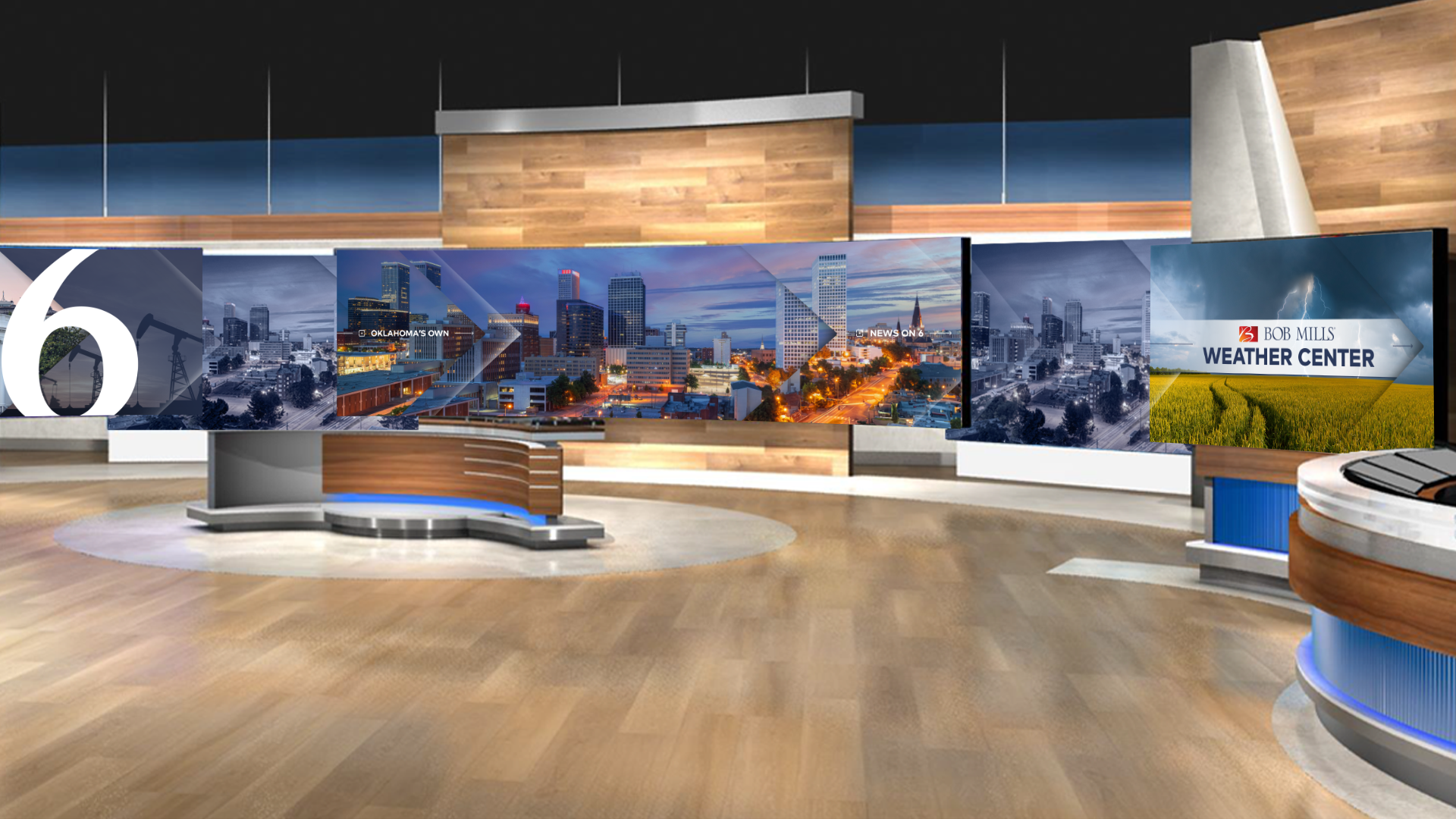
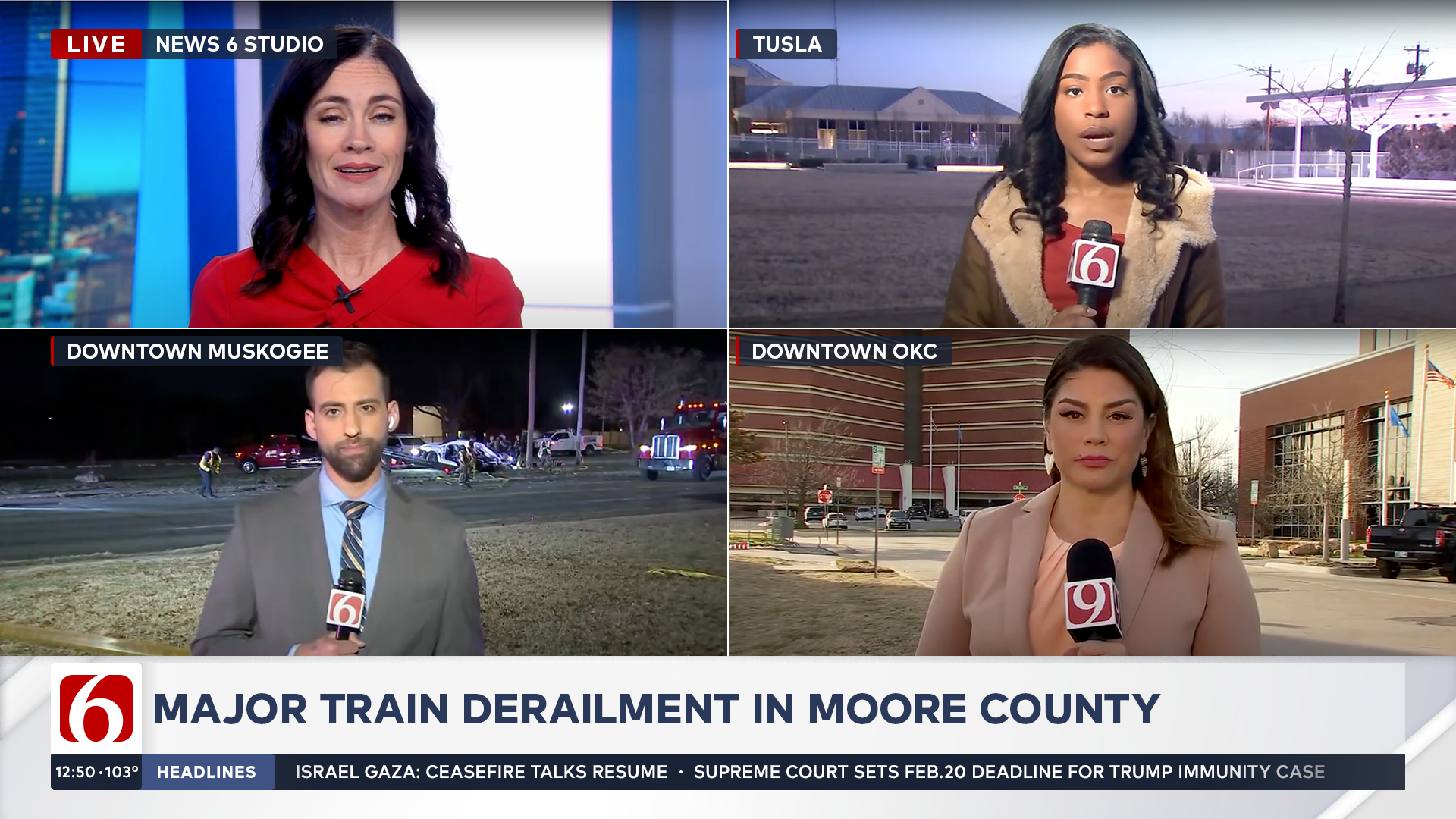
MONITOR THEORY
// THE BIG SCREEN
The monitor walls use a combination of the horizon construct and imagery that is treated with subtle overlays and shapes derived from the brand theory. The horizontal nature of the monitor walls acts as natural cropping echoing the Opens and Mini Opens. Graphical elements include subtle drop shadows, highlights, and slight image offsets that create a dynamically integrated studioscape that accompanies the graphics package.