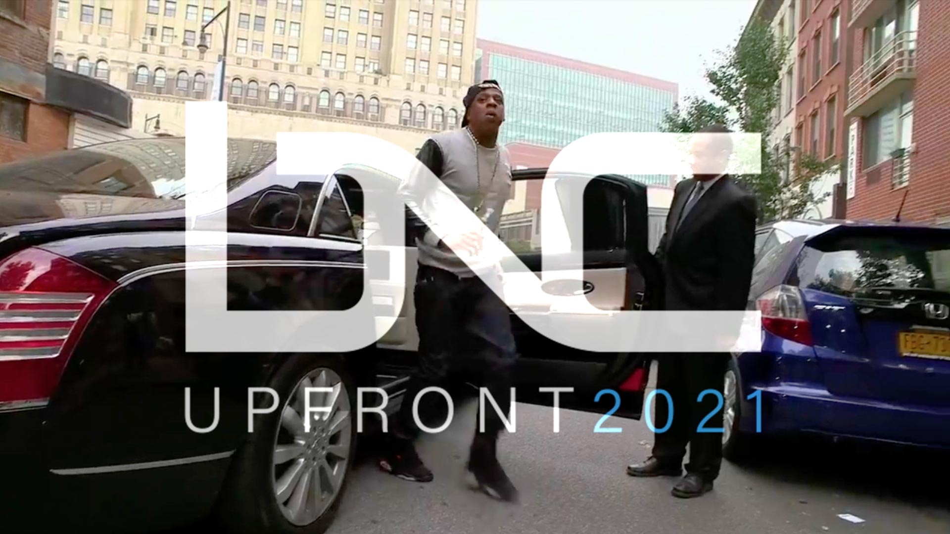
BLACK NEWS CHANNEL approached SmithGeiger Group + Vivid Zero to help find their audience and develop their brand voice to build a digital–forward, independent news platform with the goal of reaching an underserved audience.
A NEW MODEL: DATA-DRIVEN-CREATIVE
// DATA + CREATIVE WORKING TOGETHER AS ONE
Analytics and research started the process to help understand what audiences were looking for and how to fill the void in today’s cable news gap.
VIVID ZERO was involved from the beginning as our creatives attended focus groups and were involved in the early research discussions.
Working closely with SmithGeiger research and the BNC executive team, VIVID ZERO constructed a creative brand strategy and approach to take advantage of the valuable analytics + insights
BRAND MANIFESTO
// FIND THE VOICE
Creative started with the new brand manifesto to define who BNC is, focusing on their core brand values and the values our new audience was searching for. We tested our manifesto line by line to see what resonated with our focus groups. Realtime feedback helped shaped our creative and echo our viewer’s sentiments of what they were looking for from a news brand.
INITIAL SELECTS + CUTS
// 9 CLIENT SELECTS + 5 AGENCY SUGGESTED CUTS
After the first round of logo sketches were presented we like to make selects based on client feedback and hone in on a few that might be natural fits. Here we suggest four strong marks out of the 9 client selects that we felt more closely aligned to the brands objectives.
LOGO REFINEMENT + SCULPTING
// LOGO DEVELOPMEMT
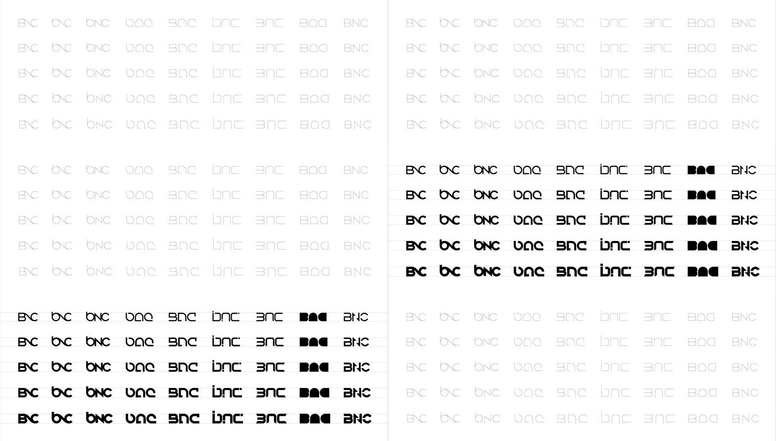
Comparing each logo at several different weights to discover the strongest and most optimal weight, we began our carving pass of the logos. Incrementally cataloging each variation to both find stronger opportunities and to document our process of exploration.
FINAL LOGO + STYLE GUIDE
// DELIVERING AN ICON
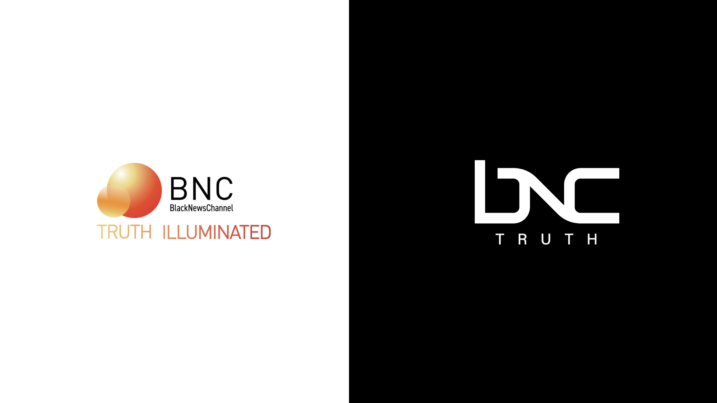
Our final choice was NOT the focus group’s top pick. Our select logo was the choice of the BNC CEO, SmithGeiger Group and VIVID ZERO… Not what that data leaned towards. Why?
We knew this one logo tested well, but it also served a higher conceptual purpose that played into our brand theme of inclusion and connection. It also felt more modern and aspirational for the brand to grow into this identity. Data helped guide our decision, and we felt confident with the choice not being our respondent’s top choice.
COLOR THEORY
// CONTENT-FOWARD APPROACH TO COLOR
Once primary flagship colors were approved, after rigorous testing, a full palette was created, and color–balance guidance provided.
LOGO VISUALIZATION
// MAKING OUR MARK
We created mock-ups to help realize our logo in different environments.
3D ANIMATION IN 3 DIFFERENT STYLES
// NOW MOVE ME
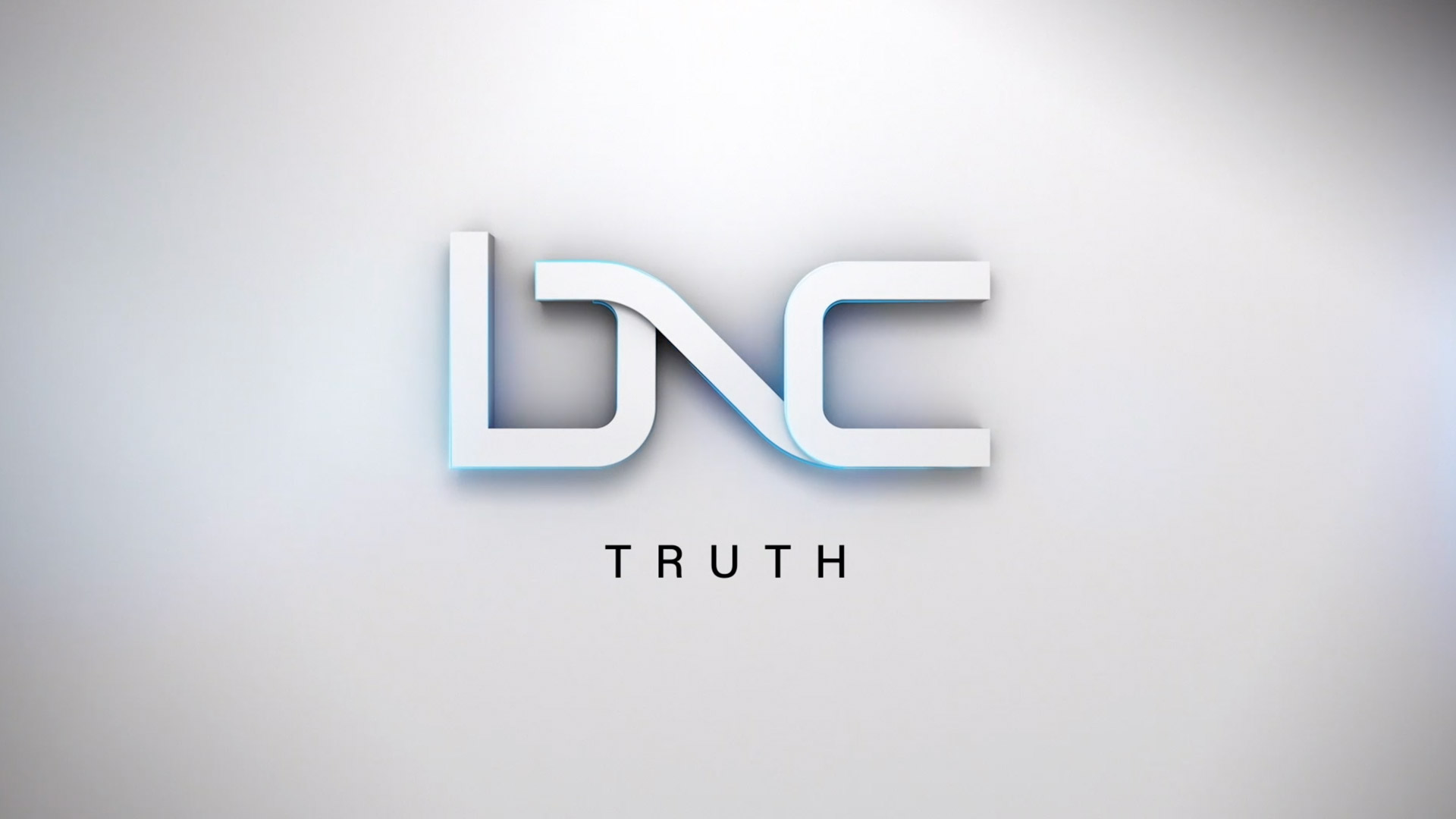
One brand living in three-day parts. We created 3D logo animation for three distinctive times of day… silver for morning, matte black for daytime coverage, and chrome for primetime.
PROMO PACKAGE
// TELL THE WORD
We created simple, clean, fast-moving and harder–hitting graphic assets for use in promotions and marketing to make certain the ‘Truth’ got out in a way that aligned with the overall BNC brand.
DIGITAL FORWARD NEWS SYSTEM
// STORYTELLING DESIGN PACKAGE
We worked with our client to push what an on-air news package is capable of doing. Early design layout and animations were created as UX/UI previews to get a sense of motion and how a digital forward approach would work in a live-linear space, as well as digital spaces.
SHOW SPECIFIC TITLE ART
// A LOGO FAMILY THAT WORKS TOGETHER + STANDS ALONE
Custom animated logos for unique shows and a system that allows future series to follow brand guidelines to create new iconic titles. Our goal was to create a brand that can evolve with or without our future involvement. Using the strong identity, typography, and color palettes, we were able to find new, original brands that fit under the larger umbrella brand of BNC.
DIGITAL + SOCIAL
// IT’S NOT REAL UNTIL IT’S ON INSTAGRAM
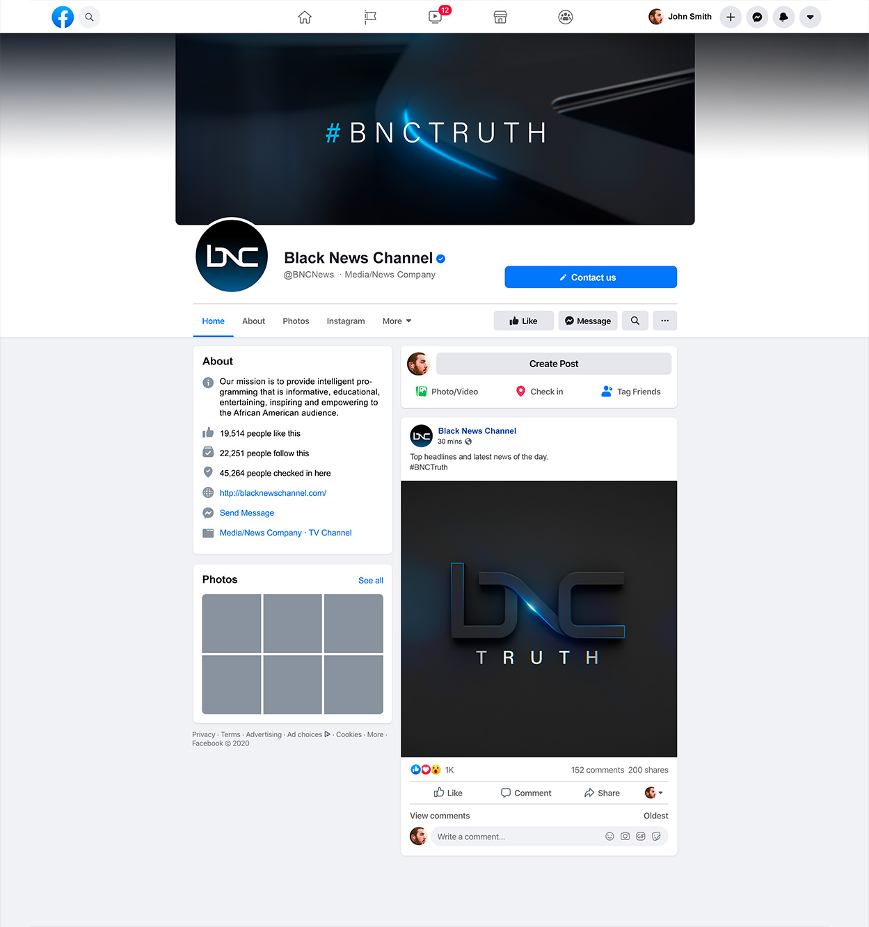
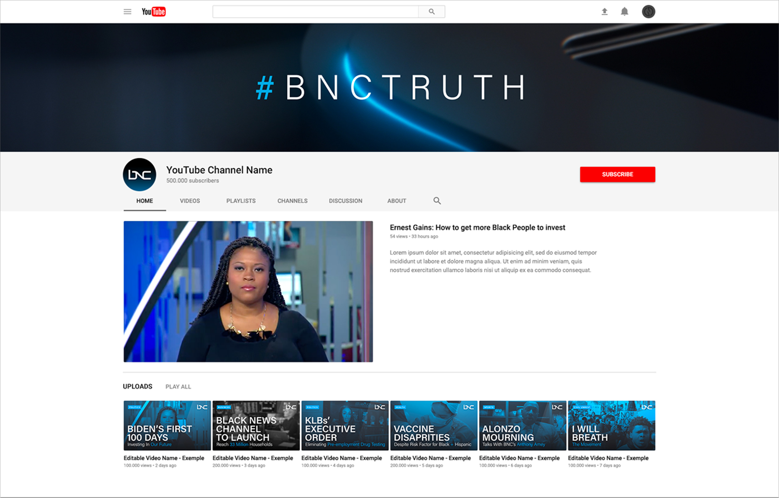
First, Vivid Zero reskinned the BNC website. Then we completely redesigned it. Today’s brands must work cross platform. At the same time, they need to maximize each of the platform’s environments. So we looked at their digital + social suite with the BNC website, their YouTube channel, Facebook, and Instagram platforms working together and also standing alone.


MUSIC / SONIC BRANDING
// SURE IT LOOKS GREAT… BUT WHAT DOES THE BRAND SOUND LIKE?
In collaboration with music partner, Dynamite Laser Beam, we helped bring the entire package together with a unique and ownable sound. We showed Dynamite Laser Beam early animation, and they would lay down music that informed our motion and our motion informed their music. It was living choreography that played well together, pushing both teams further. Once Dynamite Laser Beam hit the notes of “B” and “C”, we knew it felt like it aligned with our brand and solidified the entire approach.
BRAND + IMAGE
// KEEP PUSHING IT
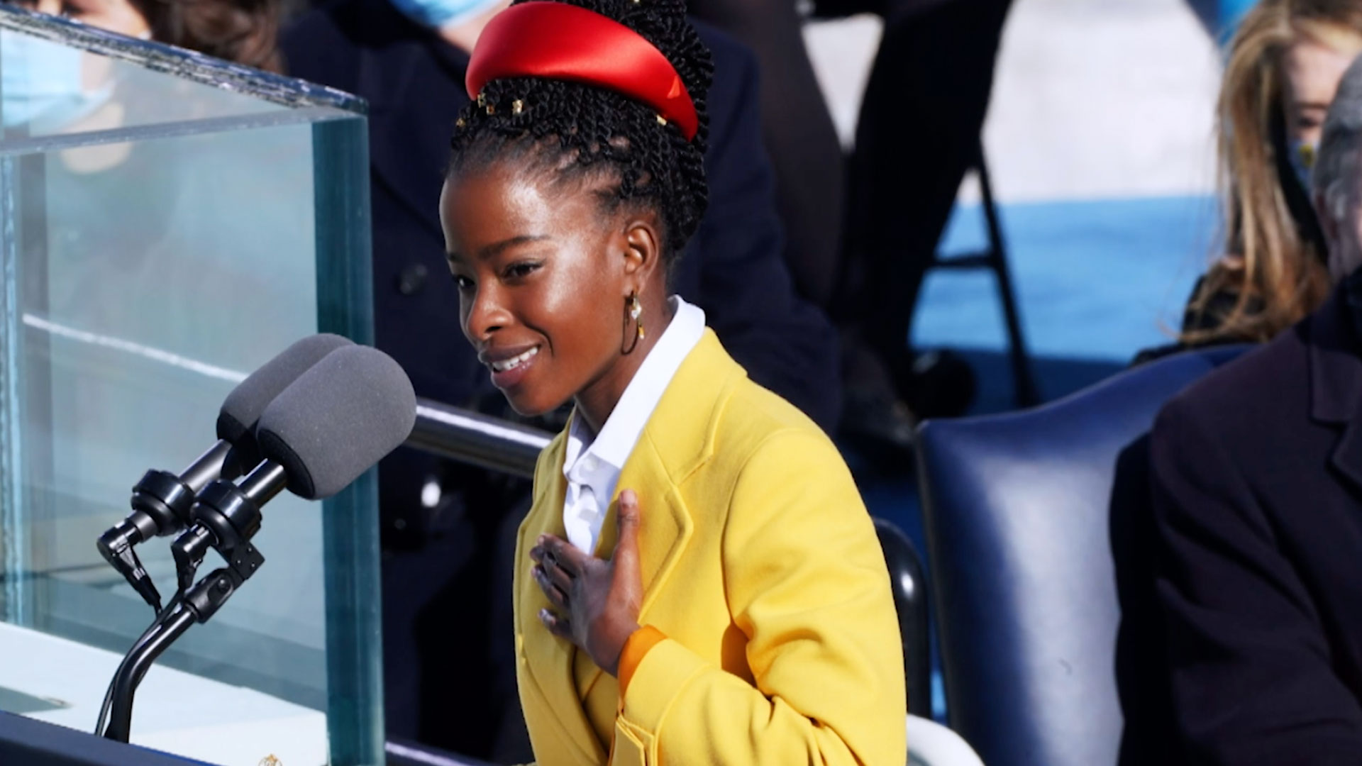
Once the brand was working, we tested our theory against brand image marketing. Creating print, outdoor, brand spots, series spots, and company sizzle reels. Bringing the voice, tone, style, and attitude together.
BEFORE + AFTER
